A public, map-based aviation resource that aggregates fragmented industry data (FAA and Transport Canada registries, empty legs, fleet information) into purpose-built products for operators, brokers, buyers, pilots, and travelers.
Role: Senior Product Designer, discovery through developer handoff
The challenge: make dense, technical, government-sourced aviation data feel searchable, trustworthy, and actionable, for audiences ranging from first-time charter passengers to professional fleet analysts.
Built for
Air operatorsCharter brokersAircraft buyersPilotsTravelers
Industry
Business / Private Aviation
Platform
Responsive web + embeds
Duration
7 months
Scope
Discovery · Research · IA · Interaction · Visual · Handoff
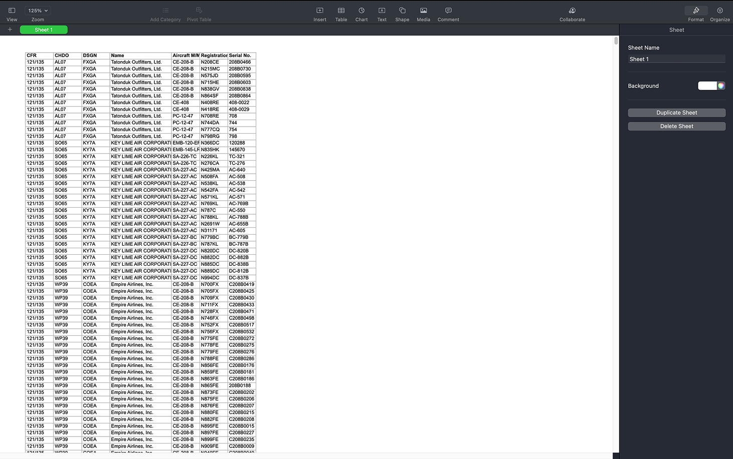
FAA and Transport Canada publish operator and aircraft data, but in raw spreadsheets and clunky search tools that make even simple questions ("which operators fly the Challenger 300?") hard to answer.
Verification
Operators can't be easily verified
DBA (trade) names rarely match legal operator names, so customers and brokers struggle to confirm who actually holds a charter certificate.
Empty Legs
Invisible inventory
Discounted repositioning flights exist across hundreds of operators, but there's no central, route-based way for travelers to discover or subscribe to them.
Operator Tooling
No modern web tools
Most charter operators can't afford custom development to present their fleet or capture quote leads on their own websites.
The design opportunity: turn an opaque, expert-only ecosystem into a discovery environment, without dumbing down the data professionals rely on.
Where verification starts today: the FAA's own search tooling
The source material: raw registry exports, thousands of rows
03Discovery
Auditing the data first
Data source audits
I worked alongside the team auditing FAA Part 135 and Transport Canada datasets to understand what could realistically be displayed. Three findings shaped the design directly:
60%
of 1,820 operators have no DBA name
30% have exactly one, and outliers have up to 46. This single finding shaped the entire DBA display pattern in the Screener.
9%
of records list a phone number, vs. 92% for CEO name
Field fill-rates varied wildly, so they decided which columns earn a place in the default table and which live behind progressive disclosure.
2
formats for every certificate number
Short designator code vs. full certificate number. Resolving it required a system-wide display audit to pick one, everywhere.
Stakeholder & persona definition
Working sessions with the client (a veteran charter operator) surfaced six distinct vendor/user types, each needing a slightly different admin experience and map view. I consolidated these into the four primary design personas below.
Competitive & analogous research
I worked two angles. For analogous patterns, no direct competitor existed for the Screener, so I borrowed mental models the audience already knew from stock screeners.
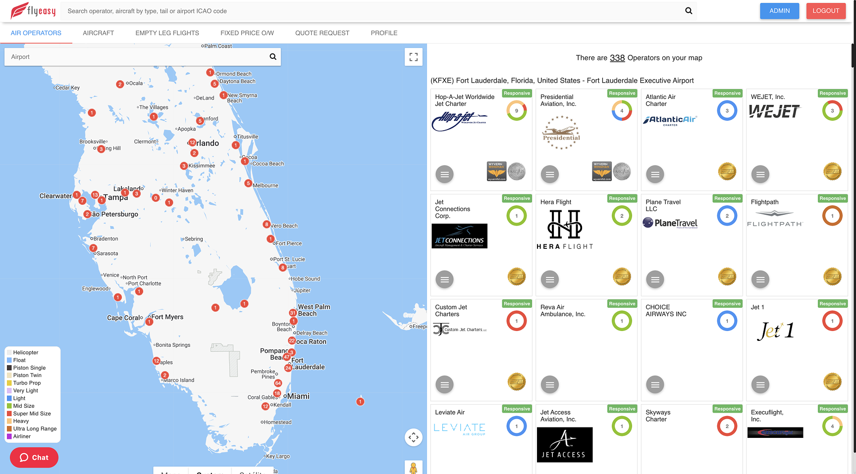
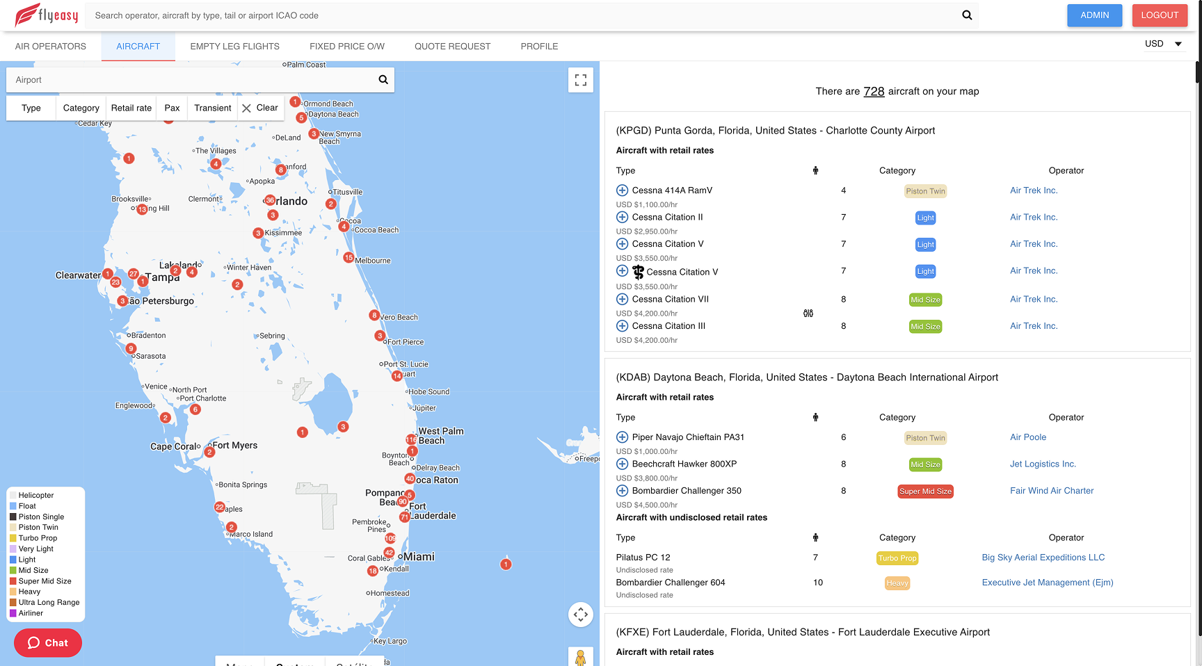
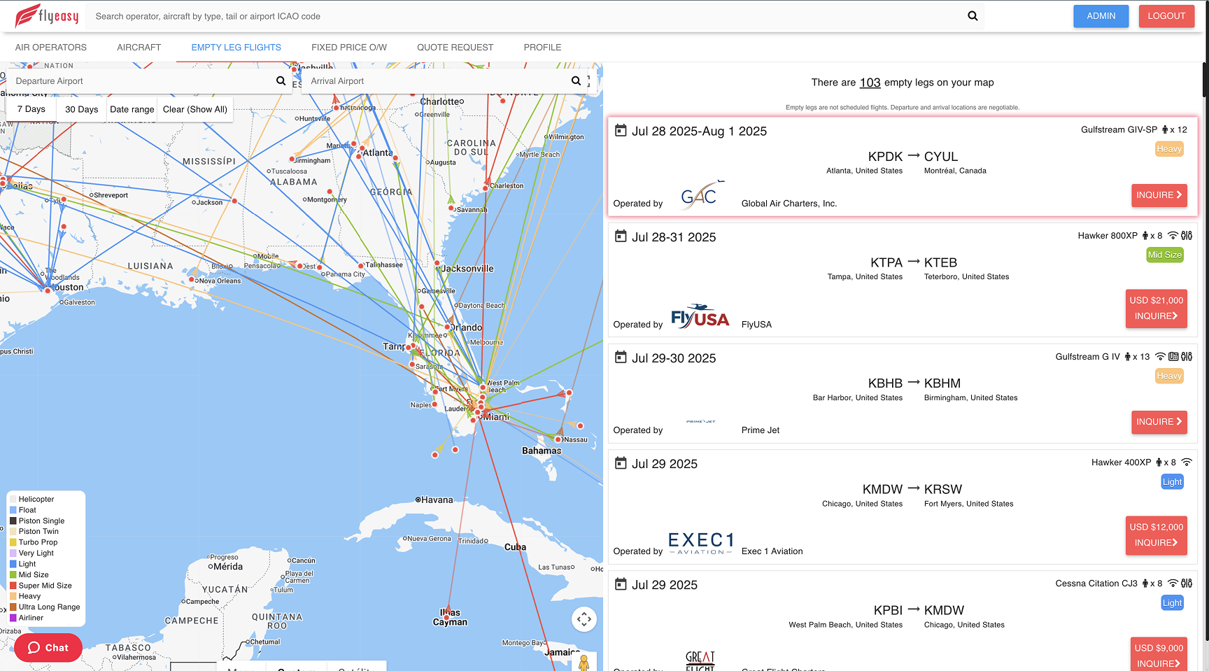
Others are attempting something similar, but the one genuinely close direct competitor is FlyEasy. Studying it alongside our client's market expert, I mapped three weaknesses to design against:
High cognitive load in the tables. Rows are condensed with no clear separation between one and the next, so the eye has nothing to hold onto.
A dated visual language. The UI no longer reads as trustworthy or professional, especially for users now used to modern interfaces everywhere else.
Flat information hierarchy. On most pages every element carries the same visual weight, so nothing guides the user through the screen.
Each of these became a design principle for the Screener: clear row separation, a modern and trustworthy UI, and a deliberate hierarchy that leads the eye.
04Personas
Four primary users
JetEye was a new venture with no user base to interview, so I ran a proto-persona workshop with the client stakeholders: assumptions made explicit, scored on a shared attribute spectrum, and designed to be re-validated against real usage data post-launch.
PERSONA 01
The Air Operator
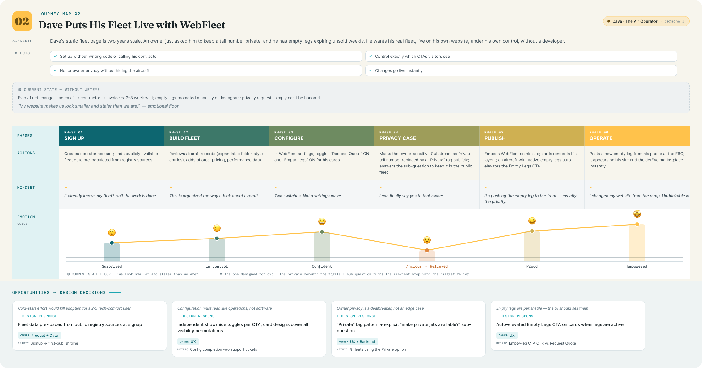
“
I run aircraft, not websites. Every hour I spend chasing a web developer is an hour I'm not selling charter.
Dave
AGE
52
LOCATION
Regional US airport city (Van Nuys / Teterboro area)
ROLE
Owner / Director of Operations, Part 135 charter operator
COMPANY
8 to 15 aircraft · ~40 employees · family-built business
ENVIRONMENT
Hangar, FBO lounge and office; desktop by day, phone on the ramp
TOOLS TODAY
Avinode · spreadsheets · static website · part-time web contractor
Bio
Dave has spent 25 years building his operation from two turboprops to a mixed jet fleet. He knows every tail number, owner, and crew rotation by heart, but his web presence tells none of that story. Fleet changes take weeks to appear online. Empty legs get posted to Instagram by his ops coordinator and expire before anyone sees them. He's protective of certain owners who don't want their tail numbers public, and skeptical of any platform that wants to "own" his customer relationships. He'll pay for tools, but only ones that visibly generate leads or fill empty legs.
Haves · Needs · Wants
HAS
A real fleet, a certificate, repeat clients, and empty legs going unsold every week
NEEDS
Self-serve control of his public fleet presence; quote leads captured from his own website; empty legs surfaced the moment they exist
WANTS
To look as polished as the big national operators; to hide/show CTAs and tail numbers on his terms; proof (analytics) that the tools pay for themselves
Attribute Spectrum
Tech Comfort
2/5
Aviation Data Literacy
5/5
Price Sensitivity
3/5
Usage Frequency
4/5
Session Depth
3/5
Decision Authority
5/5
Pain Points
Static fleet page misrepresents current availability, costing him credibility and bookings
Empty legs are perishable inventory with no distribution channel
Zero control: every website change goes through a contractor and a wait
Owner privacy requests (hide the tail number) are impossible with his current setup
DESIGN IMPLICATIONS
WebFleet's toggle-based configuration (no code, no jargon), the "Private" tail-number tag, and empty-leg CTA auto-elevation all exist because Dave has maximum domain knowledge but minimum patience for web tooling.
PERSONA 02
The Charter Broker
“
Anyone can claim a fleet on a phone call. I need to know what's actually on the certificate before I put my name on it.
Sarah
AGE
38
LOCATION
Major metro (NYC / Toronto), fully remote
ROLE
Independent charter broker; previously at a large brokerage
ENVIRONMENT
Two monitors, twelve tabs, phone permanently on ear
Sarah's business is trust arbitrage: clients pay her to know which operators are legitimate, safe, and actually have the aircraft they claim. Her nightmare is booking a client onto an operator whose DBA doesn't match any certificate. Today, verification means 40 minutes across clunky government sites, per operator. She also curates a "virtual fleet" of vetted partner aircraft to present broader availability. She would use a verification tool daily and evangelize it to her broker network if it saved her even half the lookup time.
Haves · Needs · Wants
HAS
Deep operator relationships, a mental map of the market, strong BS detector
NEEDS
Fast operator↔aircraft cross-reference; DBA-to-legal-entity resolution; certificate numbers and issue dates at a glance
WANTS
Fleet composition history; exportable views for client due-diligence packets; a virtual fleet under her brand
Attribute Spectrum
Tech Comfort
4/5
Aviation Data Literacy
5/5
Price Sensitivity
2/5
Usage Frequency
5/5
Session Depth
4/5
Decision Authority
5/5
Pain Points
DBA names rarely match legal operator names, so verification is genuinely hard
Government search tools are slow, fragmented across two countries, unsearchable in any modern sense
No way to see how long an operator has held a certificate without digging
Repeats the same lookups constantly because nothing is saved or organized
DESIGN IMPLICATIONS
Sarah is why the Screener searches across name, DBA, base, and certificate number simultaneously; why the DBA "+N" badge exists; and why full certificate numbers replaced short designator codes across the system.
PERSONA 03
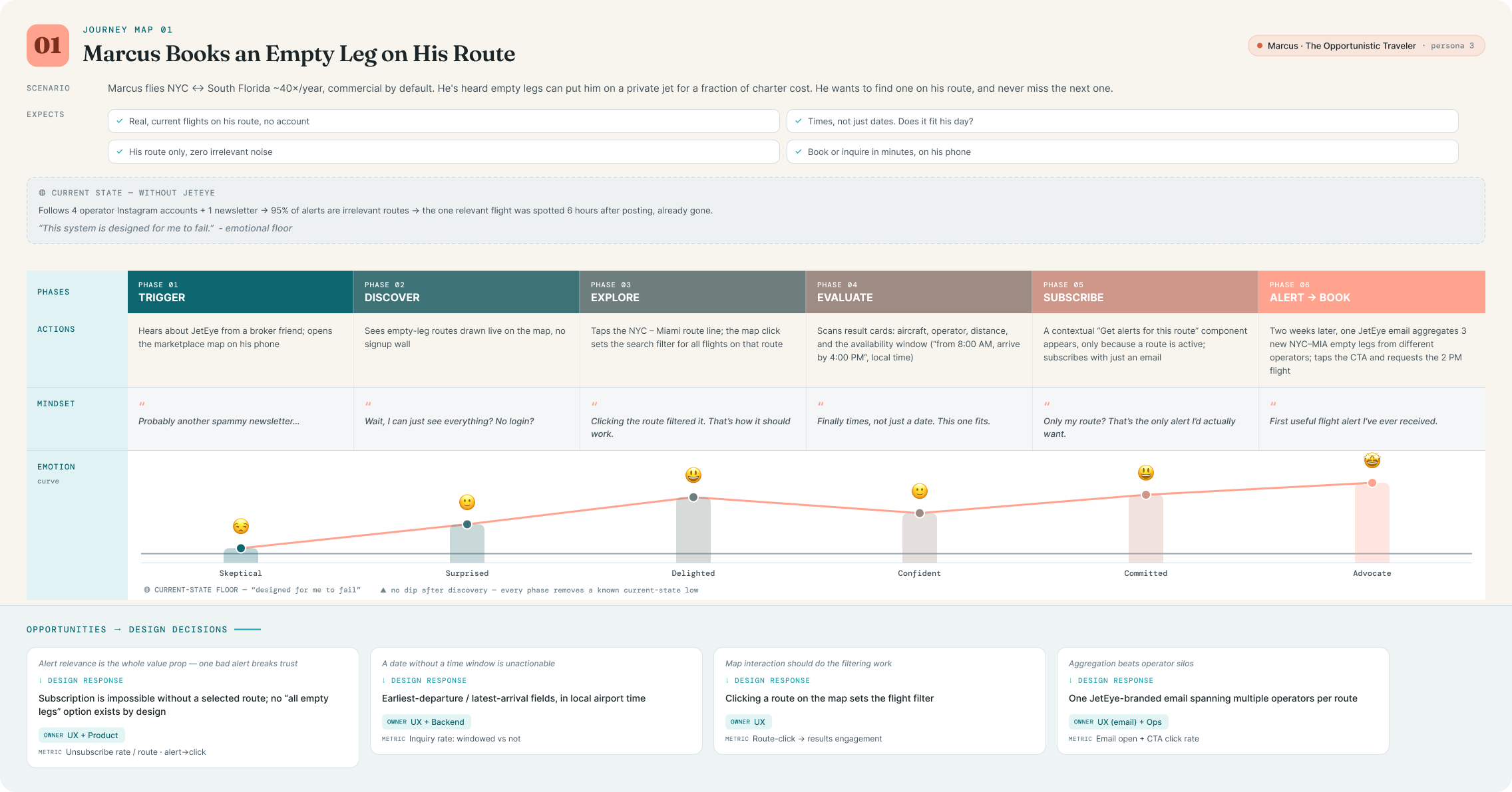
The Opportunistic Traveler
“
I don't need to fly private. But if a jet is deadheading Miami to Teterboro on a Friday anyway, call me.
Almost entirely mobile; discovers via social and search, decides fast
TOOLS TODAY
Operator Instagram accounts · one spammy empty-leg newsletter · Google
Bio
Marcus flies the same corridor forty times a year. He's taken three empty legs before and loved them. The problem is finding them. Every source is either a firehose of flights he'll never take or an operator-specific list he has to remember to check. He won't create an account to browse, won't tolerate irrelevant emails, and will unsubscribe at the first off-route alert. But for his route? He wants to be first to know, and he'll book within the hour.
Route-specific discovery (map or search); instant clarity on when the aircraft is actually available, in local time
WANTS
Alerts scoped to exactly his route across all operators; zero-friction subscribe and equally zero-friction unsubscribe
Attribute Spectrum
Tech Comfort
4/5
Aviation Data Literacy
1/5
Price Sensitivity
4/5
Usage Frequency
2/5
Session Depth
2/5
Decision Authority
5/5
Pain Points
Empty legs are scattered, perishable, and discovered too late
Existing alert systems are all-or-nothing, and irrelevant notifications kill trust
Listings show a date but not a time window, so he can't tell if a flight fits his day
Operator sites bury availability behind quote-request forms
DESIGN IMPLICATIONS
Marcus is why subscription is only possible after selecting a route, why clicking a route on the map sets the filter, why availability windows show in local airport time, and why the alert email aggregates all operators on one route with a single CTA.
PERSONA 04
The Analyst / Prospective Owner
“
Every ownership budget I've seen ignores charter revenue. That's the whole decision.
Alex
AGE
41
LOCATION
Chicago
ROLE
Advisor at an aircraft management company; represents first-time buyers
ENVIRONMENT
Desktop, long analytical sessions; lives in Excel and market reports
TOOLS TODAY
Bloomberg-style screeners · Conklin & de Decker cost data · JETNET-type reports · hand-built models
Bio
Alex translates aviation into numbers for people about to spend eight figures. Two questions dominate his work: what does the market look like (which operators are growing, which types are popular, where fleets concentrate) and what will this aircraft actually cost under different operating structures. Registry analysis today means downloading FAA spreadsheets and rebuilding pivot tables monthly. Budget modeling means bespoke spreadsheets that clients find impenetrable, and none of them model charter revenue offsets convincingly. He thinks in screener grammar: filters, ranked lists, saved views.
Registry data as a filterable, sortable, groupable dataset; fleet growth and diversity signals; budget models reflecting real operating structures
WANTS
Pre-built ranked lists as starting points; custom multi-filter queries; white-label, shareable budget outputs for clients
Attribute Spectrum
Tech Comfort
5/5
Aviation Data Literacy
4/5
Price Sensitivity
1/5
Usage Frequency
3/5
Session Depth
5/5
Decision Authority
4/5
Pain Points
Registry insight requires manual spreadsheet archaeology, redone every month
No existing tool answers "who operates the most G650s?" in one click
Ownership budgets ignore charter revenue, the variable that changes the answer
His deliverables look like spreadsheets, not decision documents
DESIGN IMPLICATIONS
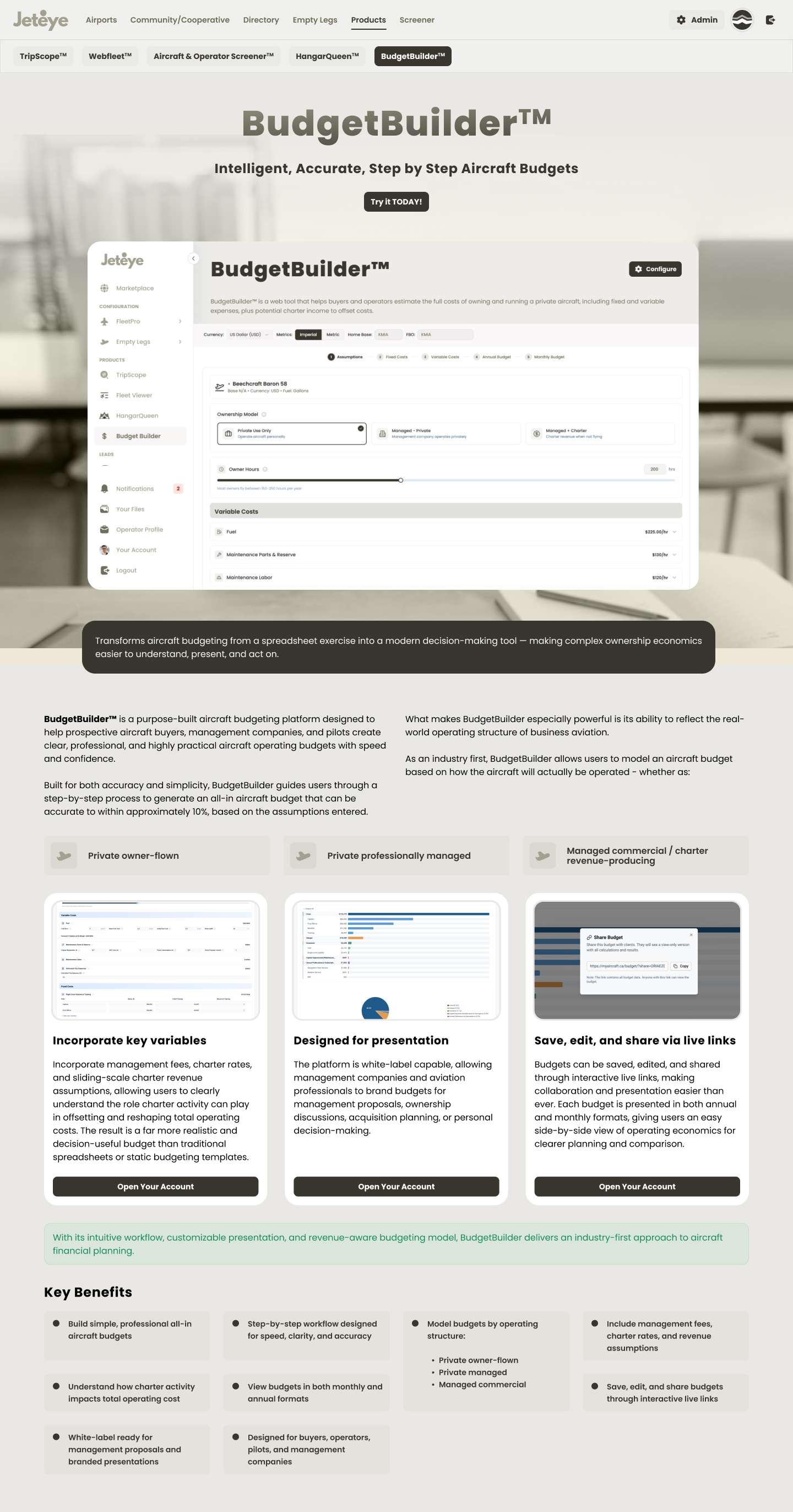
Alex justifies the Screener's novice → expert ramp: pre-made chips ("Top Bombardier Operators," "Most Diverse Fleets") escalating to the 8-filter custom builder, and BudgetBuilder's operating-structure model with charter revenue offsets.
1 / 4
What the spectrum comparison revealed
Data literacy splits the platform in two. Dave, Sarah and Alex can handle dense tables; Marcus cannot, which is why the marketplace map and the Screener have deliberately different information densities despite sharing data.
Tech comfort is inverse to domain knowledge for operators. Dave knows the most about aviation and the least about software. WebFleet's toggle-based admin UX is a response to that single cell.
Session depth drove surface design. Marcus gets one-tap subscribe on mobile; Alex gets an 8-filter desktop workbench. Same platform, opposite ends of the spectrum.
05User Journeys
Three core user journeys
One journey per core persona, mapped in NN/g swimlane format: actions, mindset and emotion per phase. Each map below opens full-screen.
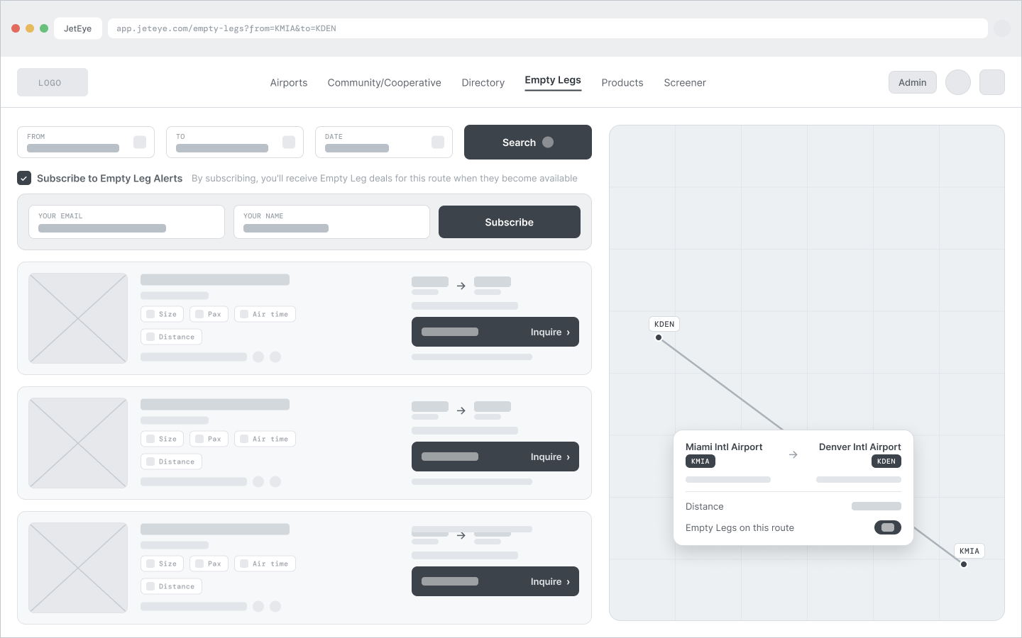
1
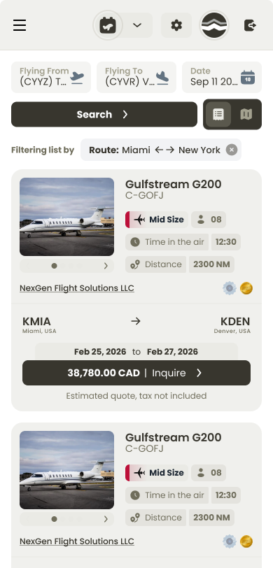
Marcus subscribes to a route's empty legs
Traveler
Discover
Lands on the marketplace map, with active empty leg routes drawn between airports.
Explore
Clicks a route, and the map interaction sets the filter, no form re-entry.
Evaluate
Each result shows distance, aircraft, operator, and the availability window in local airport time.
Commit
A contextual, low-friction "Subscribe to alerts for this route" component appears.
Return
Receives a branded email aggregating new empty legs from multiple operators on his route.
Key design decision: subscription is deliberately impossible without a selected route. This protects users from notification fatigue and keeps every email hyper-relevant. The prompt only appears after intent is already expressed.
2
Dave configures his WebFleet embed
Air Operator
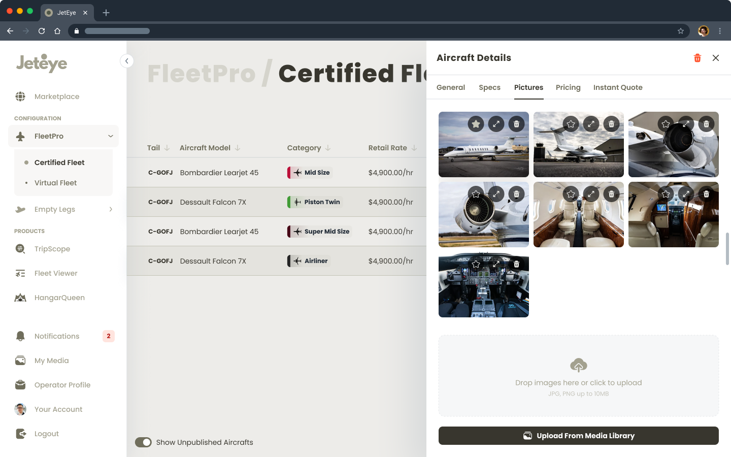
Add fleet
Adds aircraft in the Fleet admin, folder-style expandable records with specs, imagery, and pricing.
Configure
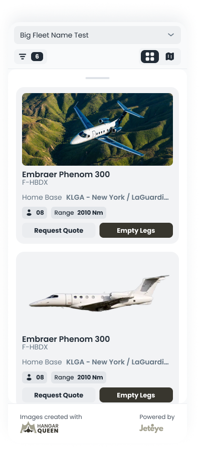
In WebFleet settings, independently toggles "Request Quote" and "Empty Legs" visibility on his cards.
Mark private
Marks an owner-sensitive jet as Private; the tail number becomes a "Private" tag on public surfaces, still visible to him and admins.
Elevate
When an aircraft has active empty legs, the card automatically elevates the Empty Legs CTA above Request Quote.
Publish
Publishes, and changes go live on his website instantly, no developer involved.
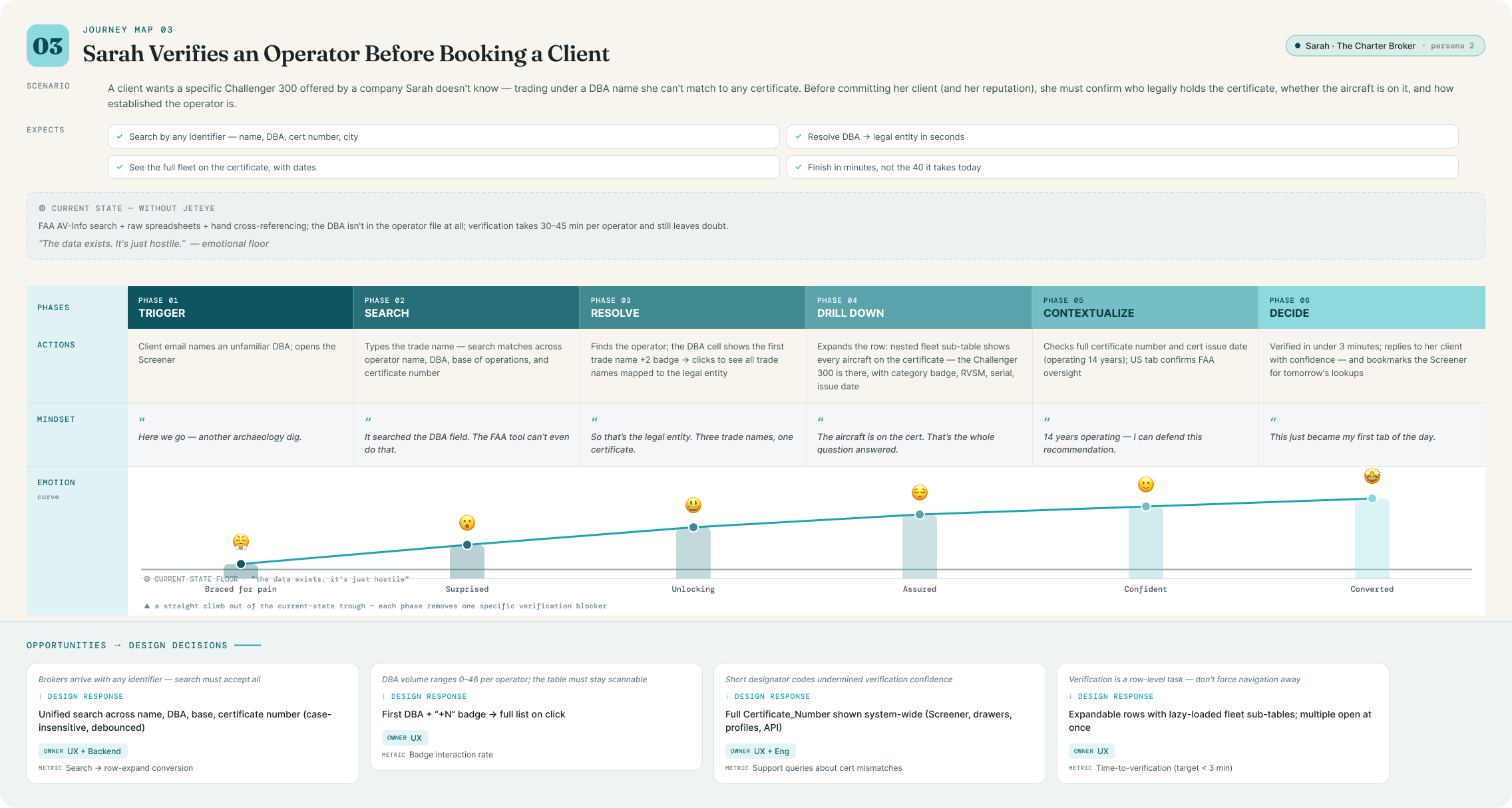
3
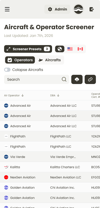
Sarah verifies an operator in the Screener
Charter Broker
Open
Opens the Screener → Operators table (1,800+ rows, virtualized).
Search
Types a DBA name in search, which matches across operator name, base of operations, and certificate number.
Expand
Expands the operator row; a nested fleet sub-table shows every registered aircraft with category badges, RVSM approval, and issue dates.
Reveal
Sees the DBA cell: first trade name + a "+2" badge, then clicks to reveal all trade names in sequence.
Verify
Confirms the full certificate number and issue date. Operator verified in under a minute.
1 / 3
Built with Claude
Designing with an AI workflow, not around it
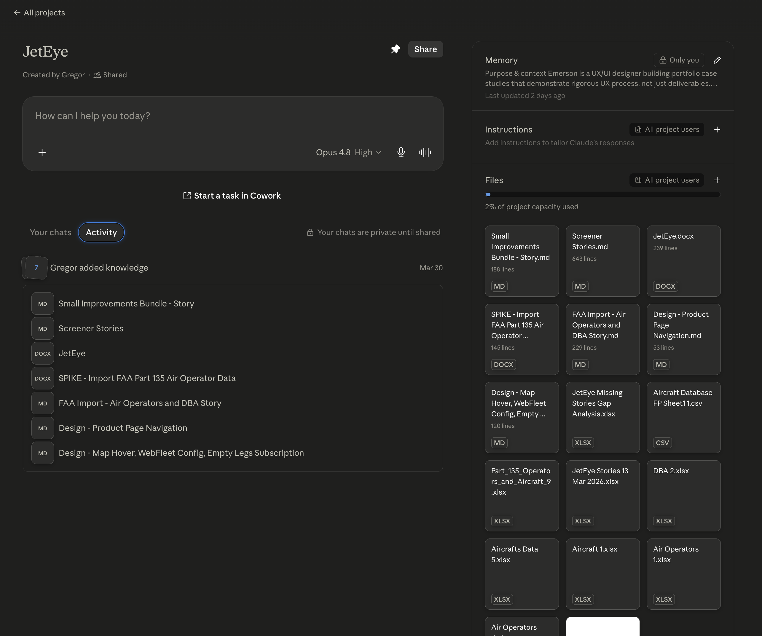
Beyond the screens, JetEye was also an experiment in how far a rigorous, context-fed AI workflow could take a solo designer. I ran the whole engagement on top of Claude, set up so every session started already grounded in the real project.
A project with the whole knowledge base
I spun up a dedicated Claude project loaded with everything the work had produced: user stories, the FAA and Transport Canada data audits, spreadsheets, research and design notes, so every conversation started grounded in the real project instead of a blank slate.
Context files for the market & the business
I distilled the domain into two living Markdown context files: one for the private-aviation market, one for JetEye's business itself. Feeding those instead of re-explaining the domain every time kept prompts sharp and cut token cost dramatically on all future work.
A branding skill wired into the team's system
I authored a Claude skill encoding JetEye's branding guidelines that plugs into the shared, generic design skills my team built. Together they generate high-quality, on-brand UI consistently, the same setup I use in Claude Code day to day.
JetEye project in Claude
The JetEye project in Claude: memory, instructions and source files in one place
06Wireframes
Wireframing the whole system
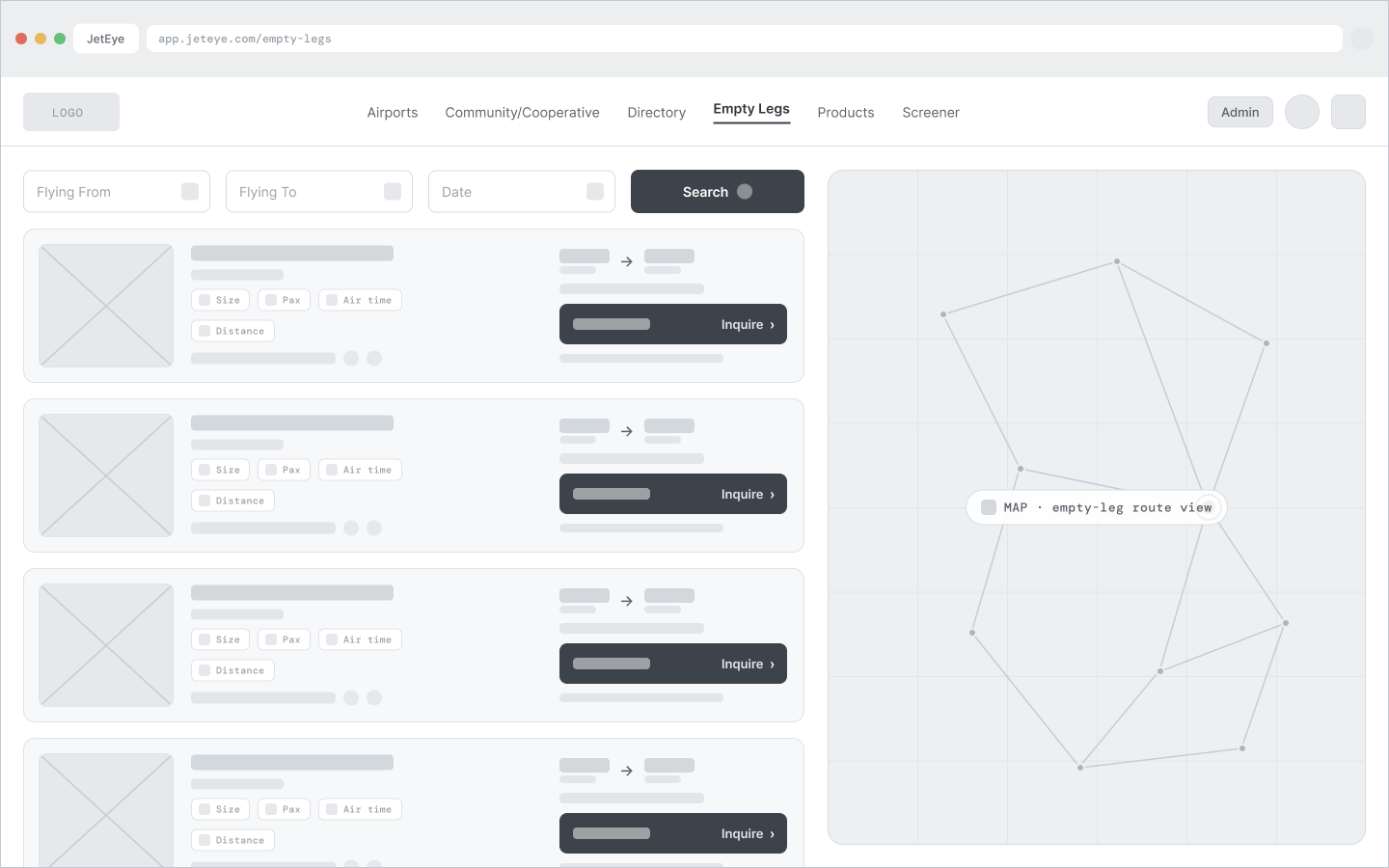
Before any hi-fi UI, I wireframed every core surface in low-fidelity grayscale, keeping the real navigation and field labels while leaving dynamic content as placeholder bars. It let me pressure-test information architecture and flows, align quickly with the client, and hand engineering a clear structural spec before committing to a single pixel of visual design.
Grayscale, low-fidelityReal UI labels keptPlaceholder contentStructure before visuals
Empty Legs marketplace
Empty Legs, route selected and subscribe
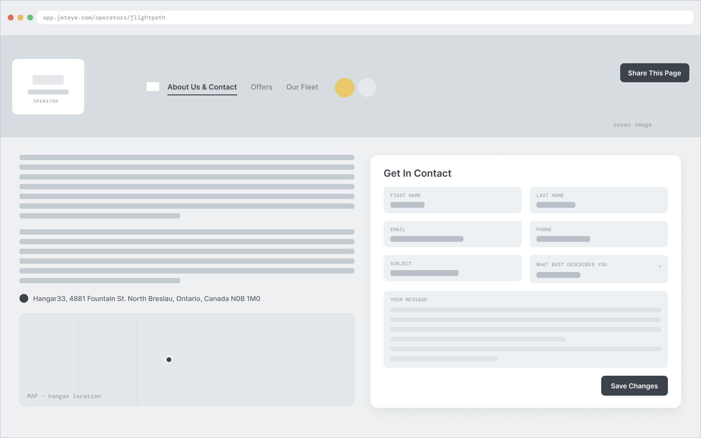
Operator page: About & Contact
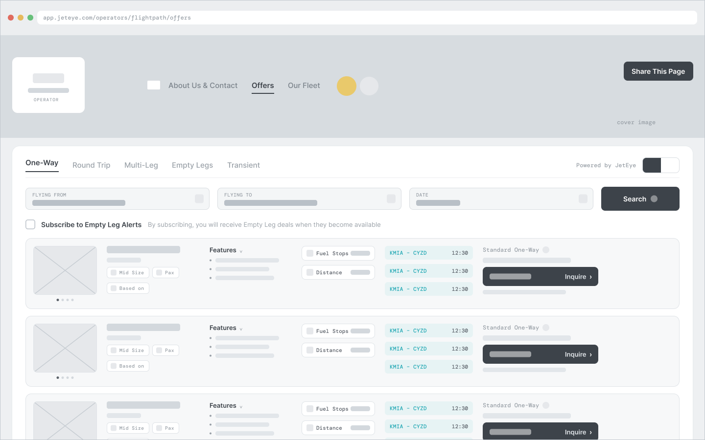
Operator page: Offers
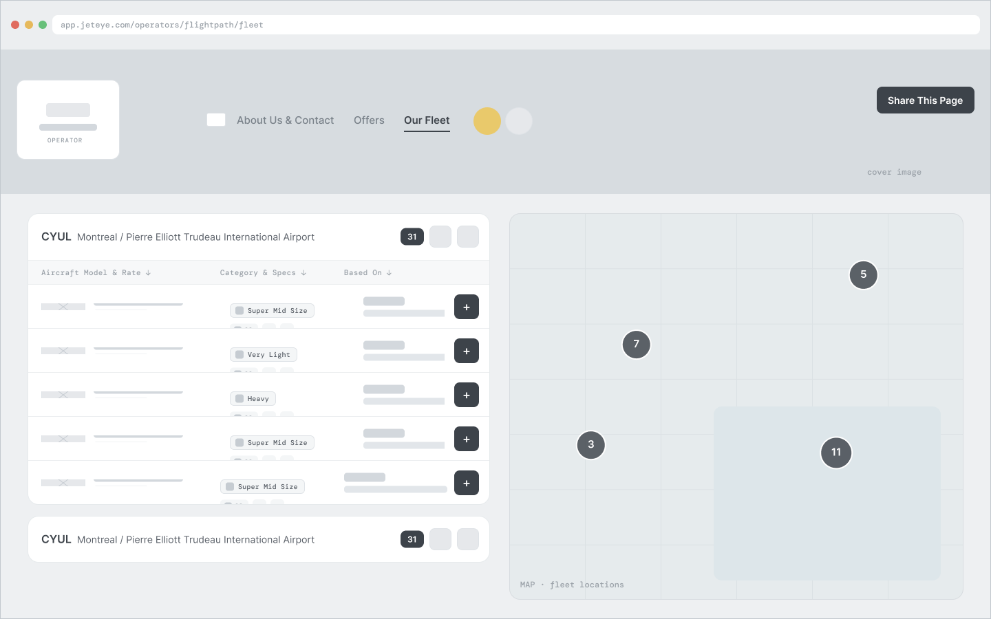
Operator page: Our Fleet
Screener: data table
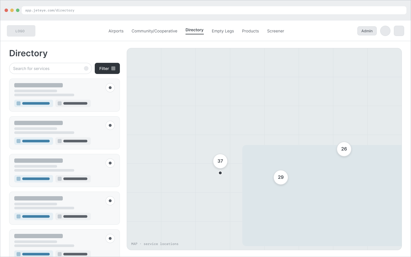
Directory
1 / 7
07High-Fidelity Design
Turning wireframes into product
With the structure settled, every surface was built to production quality on a shared design system. Each screen ran through the same five steps, so behavior and polish stayed consistent from the first embed to the last admin table. The decisions below shaped the hardest surfaces.
01
Written story
Each screen begins as a story with Gherkin acceptance criteria and explicit edge cases.
02
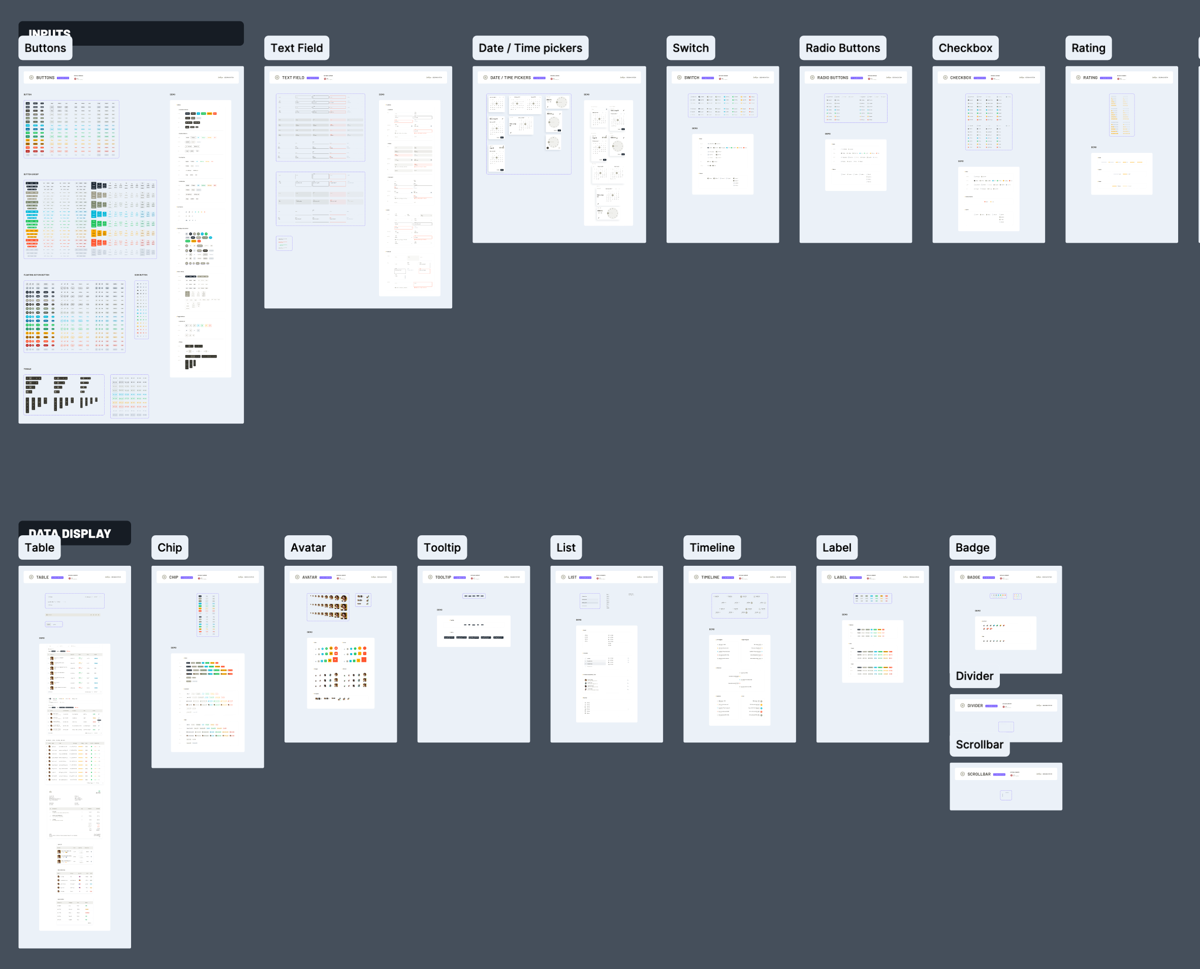
System components
Built in Figma from shared tokens and components, not one-off screens.
03
Every state
Empty, loading, error and outlier states (null data, 46-DBA rows) designed alongside the happy path.
04
Walkthrough & review
Each flow walked through a Loom and a live client review before build.
05
Design QA
Built UI verified against Figma in staging before ship.
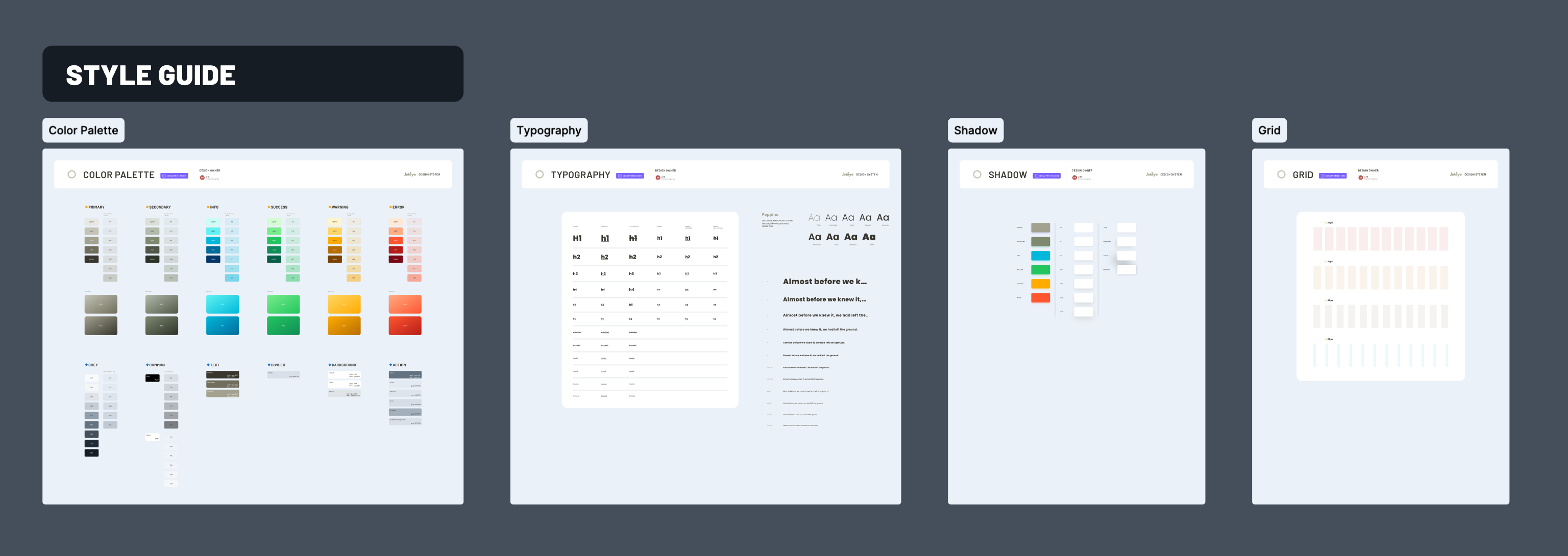
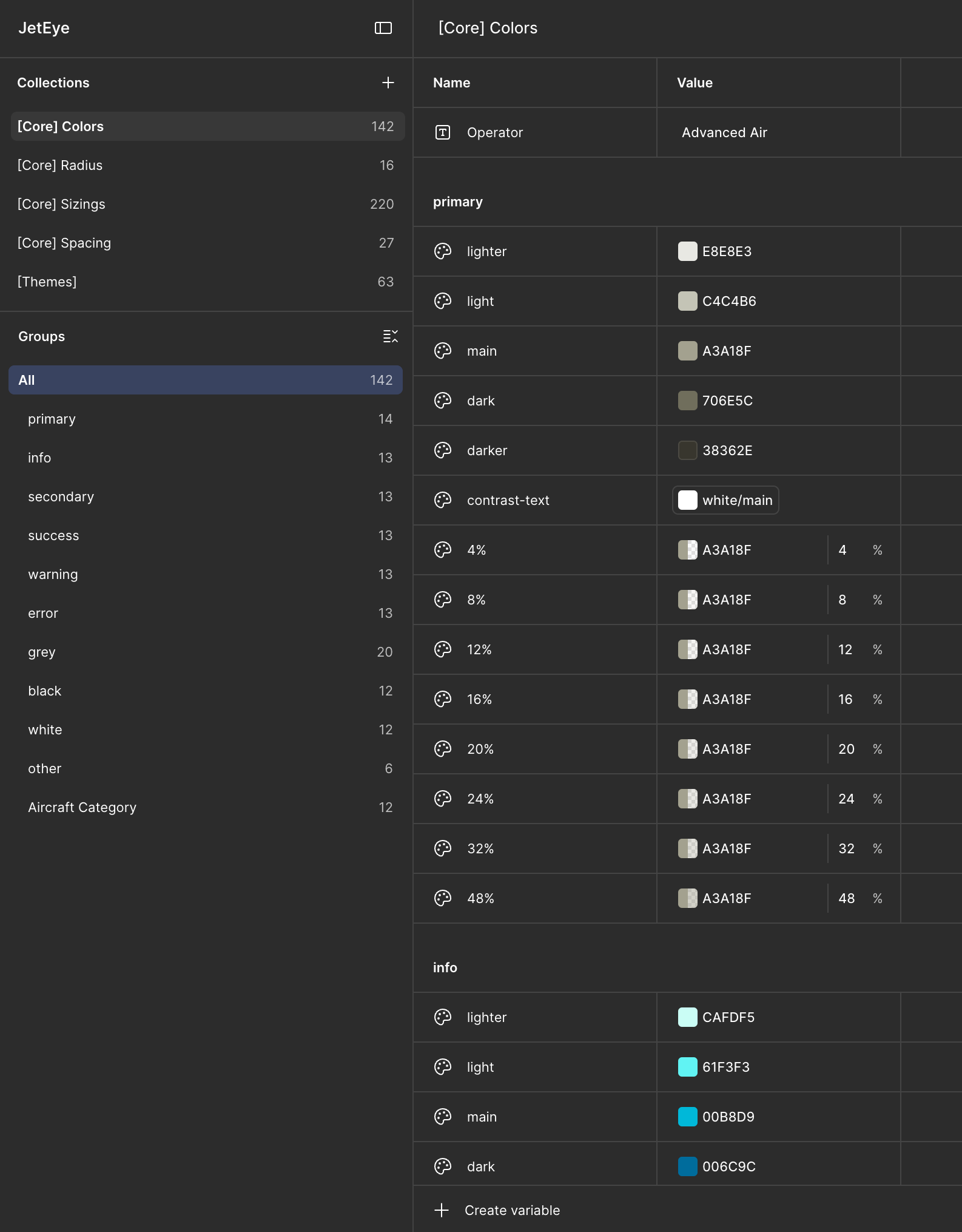
A design-system head start
My design team had already built a shared design-system template as the starting point for every project. It standardizes how we organize Figma files, structure artboards, and define tokens and components, and it cut the time we spend standing one up on each engagement by roughly 75%. Most of our clients build cost-conscious MVPs, so speed here is decisive. JetEye's own system, tokens, buttons, input fields, modals and dense data tables, came together in under half a day. Every surface from there on was designed to meet WCAG AA and to carry the JetEye brand.
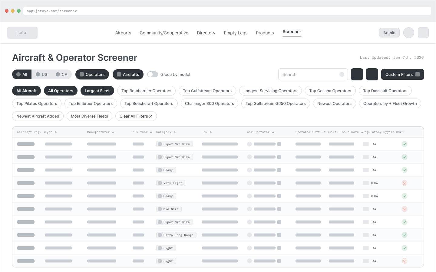
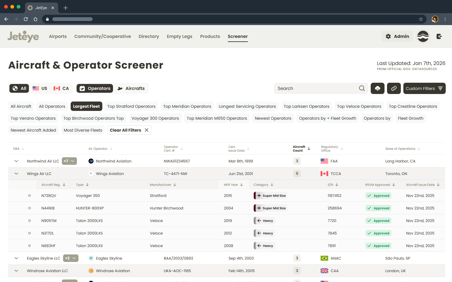
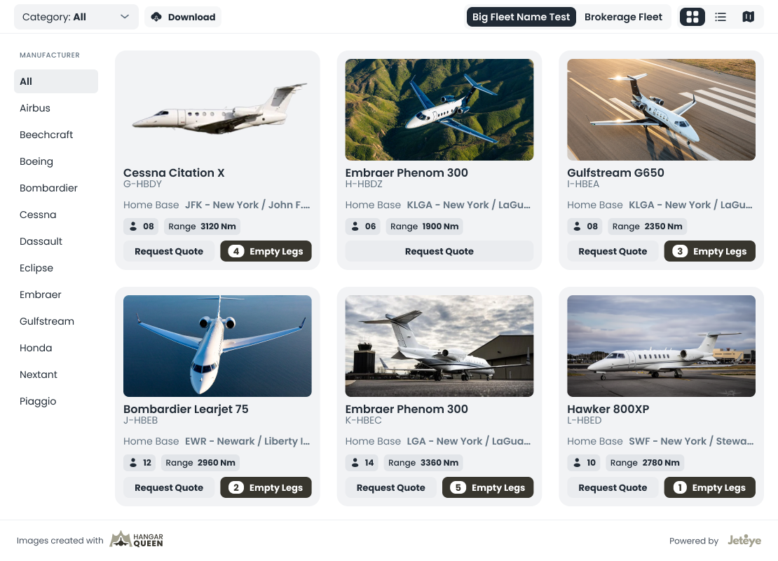
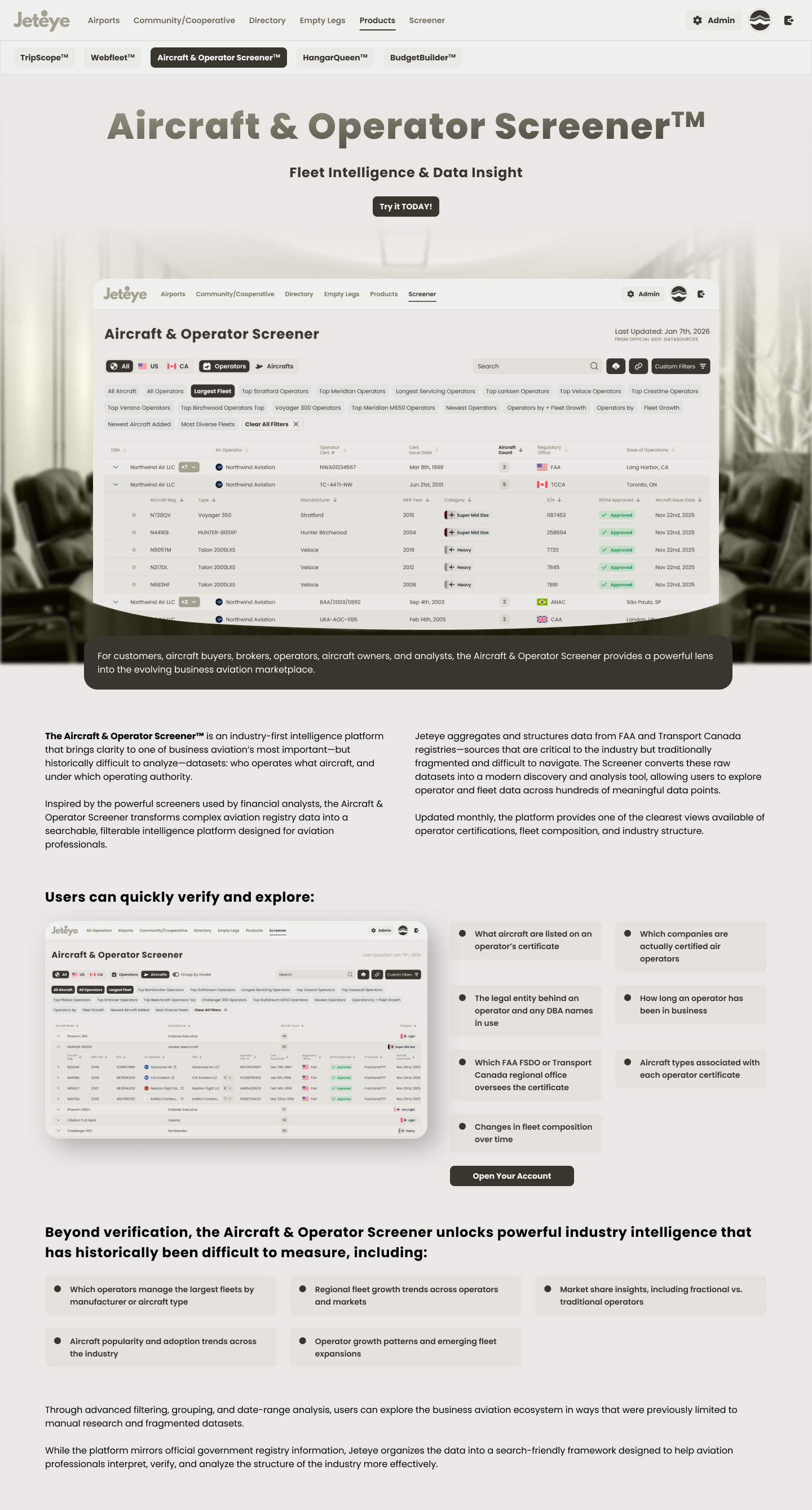
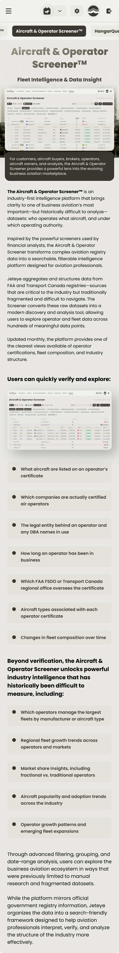
The Screener · source of truth
The Screener is JetEye's source of truth: a free, searchable registry that concentrates, compares and ranks operator and aircraft data that is scattered across government sites today. The hardest part was making a financial-terminal-grade table usable by an audience that isn't all analysts, so I borrowed the mental model of a stock screener. Verifying who actually holds a certificate (and which DBAs sit under an operator) is what turns it into a trust signal for the whole industry.
Two mental modes. An Operators view (expandable rows revealing fleet sub-tables) and a flat Aircrafts view, connected by a segmented toggle that preserves active filters.
Novice → expert ramp. Pre-made filter chips give casual users one-click curated insights, while a custom filter builder (up to 8 stacked AND/OR filters with typeahead) serves power users.
Top Gulfstream OperatorsLargest FleetMost Diverse Fleets
Recalculated context. When a manufacturer chip is active, Fleet Size recalculates to show only matching aircraft, and expanded rows filter accordingly, so the whole table tells one consistent story.
The DBA pattern. With up to 46 trade names per operator, a "first name + count badge → dropdown" pattern keeps rows scannable at any data volume. Country tabs (All / US / CA) layer on top, with flags reinforcing regulatory context.
The Screener: registry intelligence with a stock-screener mental model
Status · Launched Q3 2026 as JetEye's free front door. Success metrics were defined at launch (Screener adoption and account creation from it); measurement is in progress.
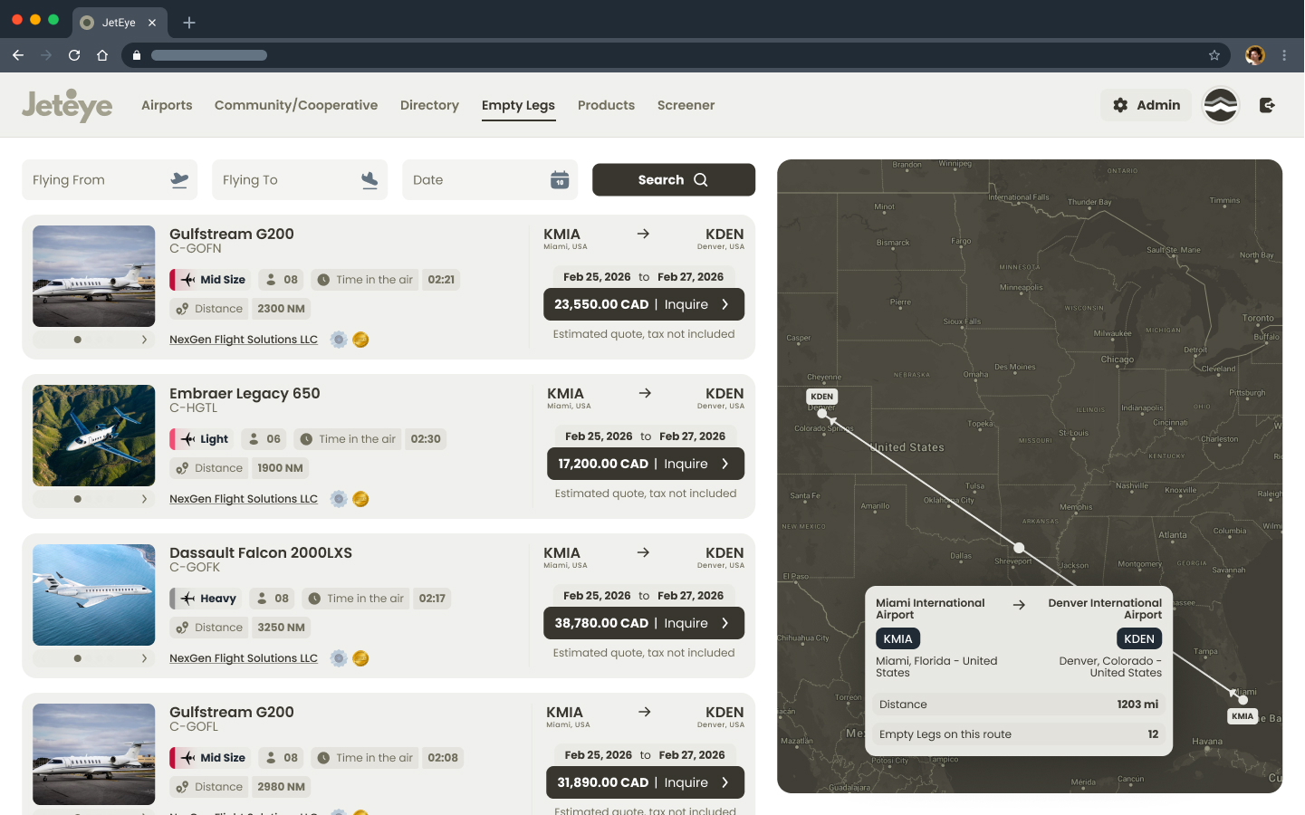
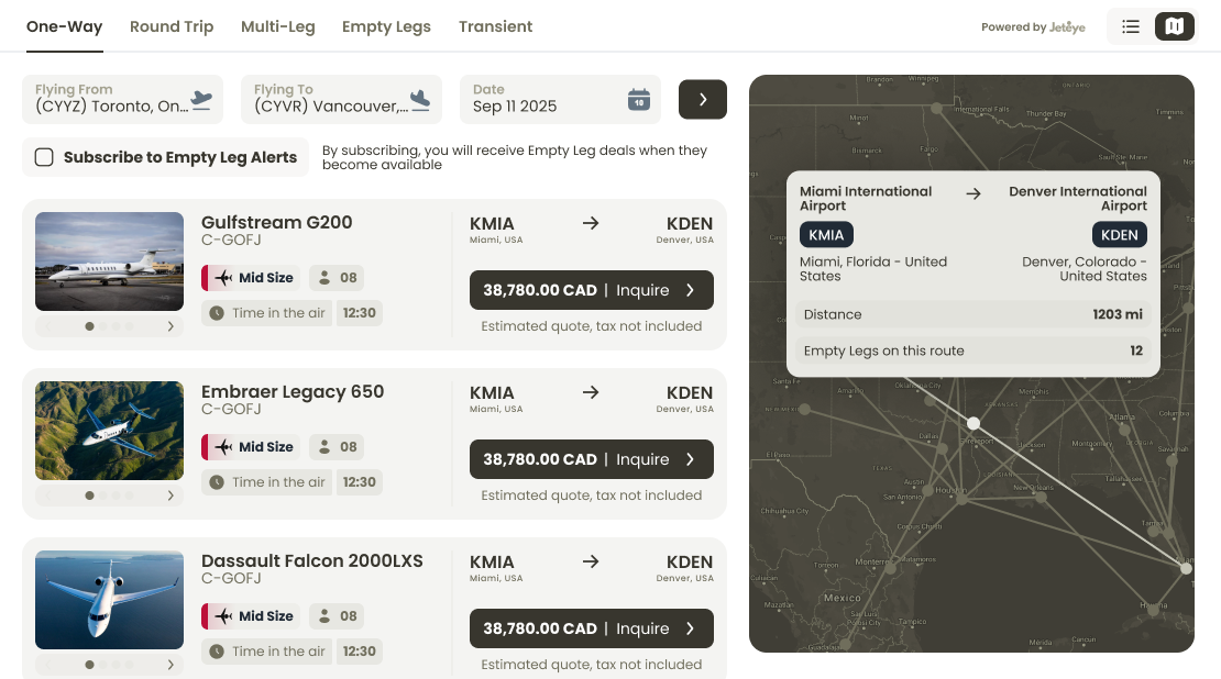
Marketplace · public discovery
The public, map-based view where empty legs and aircraft from every operator become browsable in one place. Travelers explore active routes, and a contextual prompt lets them subscribe to alerts for a specific route, so every email stays relevant. It is also where JetEye's own listings surface alongside the operators' embeds.
Marketplace: empty legs across all operators, discoverable by route
A large part of the work lived in the map itself, where two different information needs had to coexist:
Airport hover tooltips showing name, location, elevation, size classification and runway data, with a compact preview plus a "more info" expansion so single-runway strips and multi-runway hubs both stay legible.
Runway length slider (2,500 to 20,000 ft) as a first-class map filter, because runway length determines which aircraft can physically land.
Two information scents, separated. People on the map are looking for flights, but the client needed airport data visible too. The hover layer separates the two without mixing them into the results.
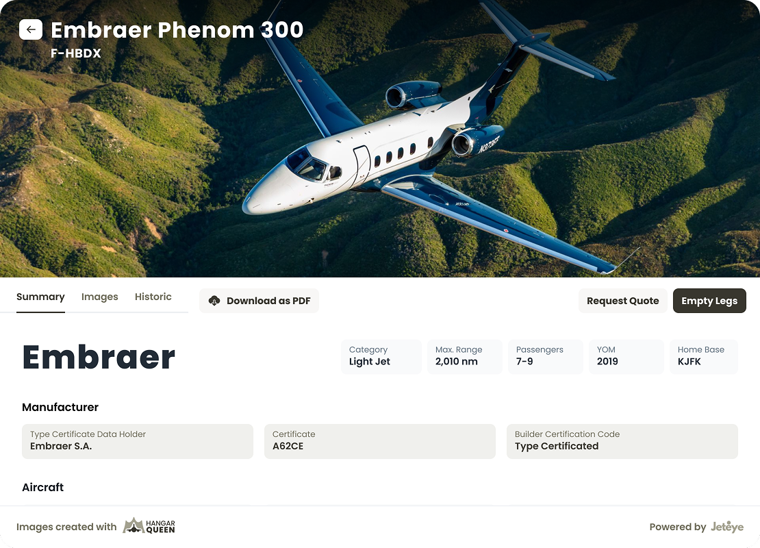
FleetPro · operator fleet management
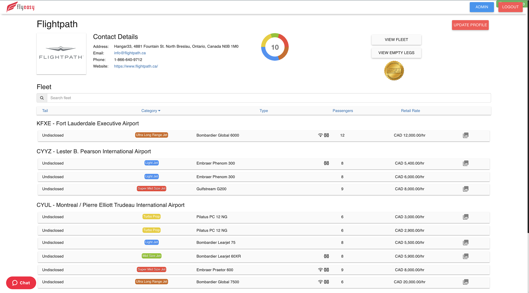
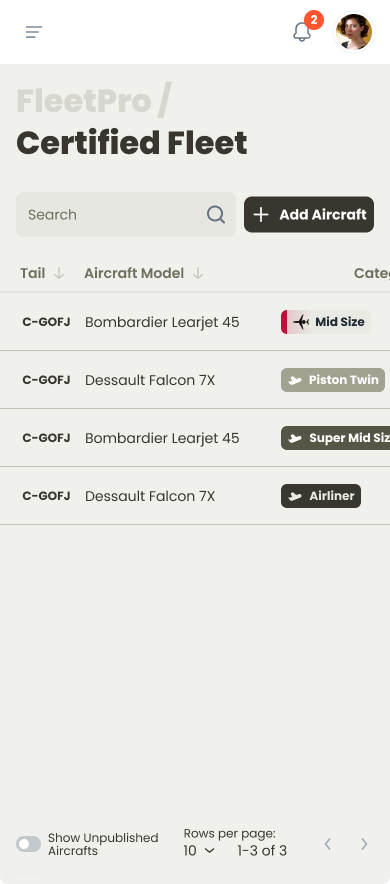
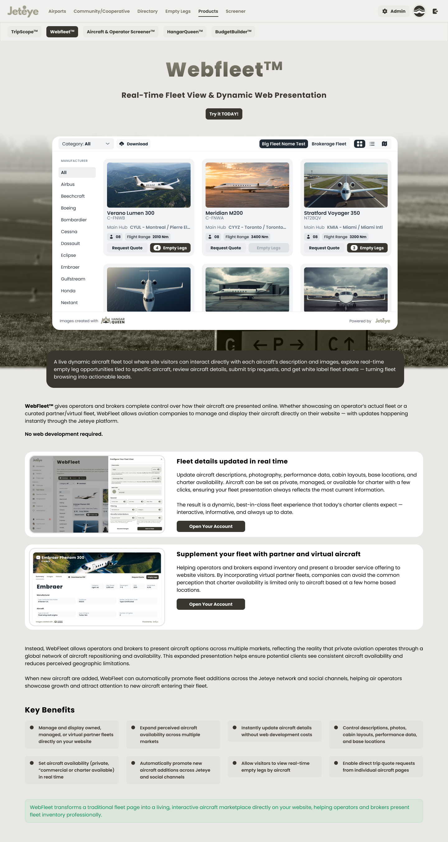
The admin tool where an operator manages both the aircraft they own and the ones they only operate for others. Fleet management here is still archaic, and every new platform forces an operator to re-enter their whole fleet from scratch, which becomes a real objection to switching once a fleet is large. FleetPro pulls every aircraft registered to the operator with the government bodies automatically, then lets them edit or add entries by hand. It is also the single source that feeds the embeds and the marketplace, so a change made once propagates everywhere.
FleetPro: the fleet source that feeds every other surface
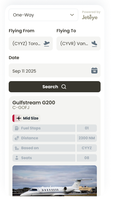
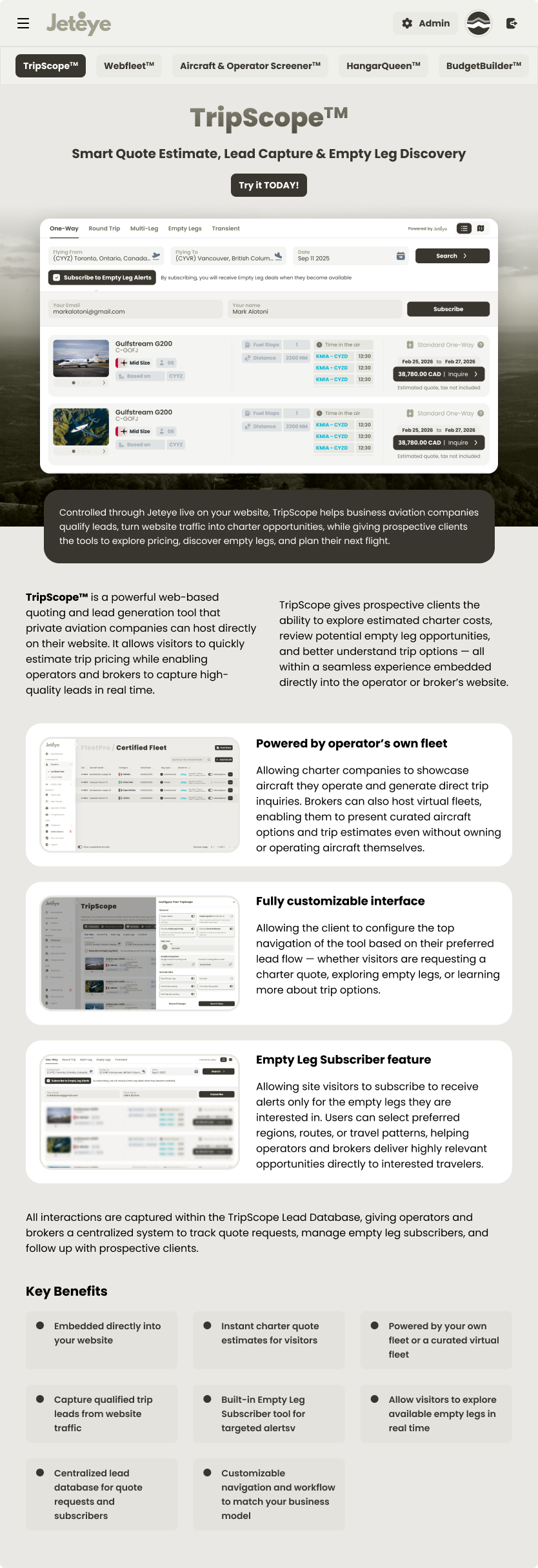
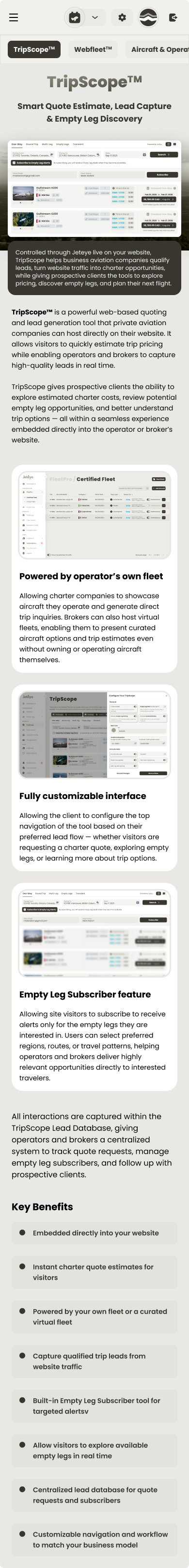
TripScope · embeddable quoting & empty legs
An embeddable widget that shows the flights and empty legs an operator has available. Travelers usually go straight to an operator they already trust, then request a flight by email or phone without knowing what is actually available right then. With a setup simple enough for anyone with basic web knowledge, an operator embeds TripScope on their own site (and optionally lists in the JetEye marketplace too), handling every request in one place. Offers are configured in FleetPro, and an operator can even resell competitor offers with a markup to cover routes their own fleet wouldn't.
Living inside someone else's site set the constraints: a neutral, configurable visual language that doesn't fight the host brand, card designs for every CTA permutation (both buttons, one, or neither), and tight copy, where "Flying From / To" became simply "From / To".
TripScope: designed to perform inside someone else's brand
Status · In rollout. The launch metrics being tracked are the time from first interest to a booked flight, and request volume once operators turn on competitor offers.
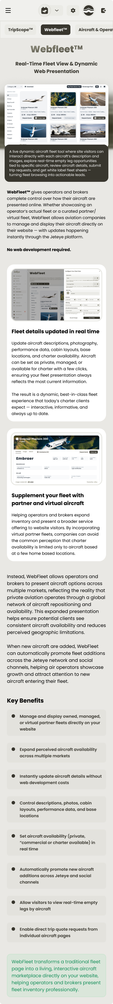
WebFleet · embeddable live fleet
The other embeddable, focused on presenting an operator's aircraft, both owned and managed. Listing aircraft is as fiddly as listing flights, especially with third-party aircraft that need to appear or disappear at specific moments. WebFleet is an iframe wired to JetEye that updates the fleet centrally, and optionally independently, across the embed, the marketplace and the email offers.
Status · Success is measured in the administrative time an operator spends keeping their public fleet current; tracking begins as operators onboard.
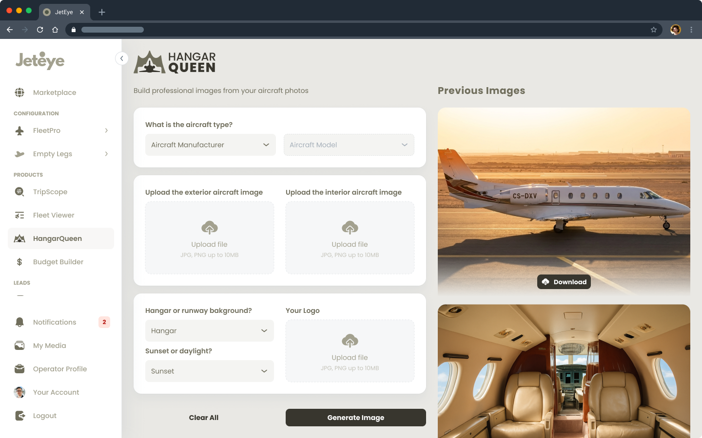
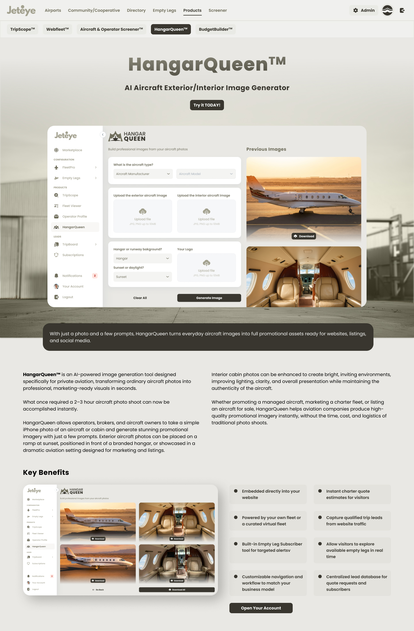
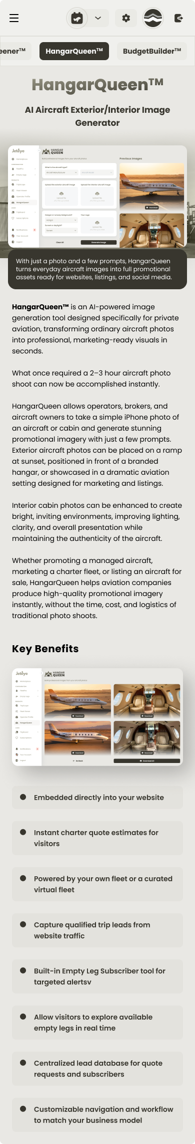
HangarQueen · AI aircraft imagery
An image generator built on an AI model trained specifically for this use case. Professional aircraft photography is punishing: operators have to take a jet out of service, losing thousands in revenue, and pay a photo crew. HangarQueen turns amateur photos uploaded to the platform into polished shots on the runway or in front of a hangar, carrying the operator's brand. While the AI team trained and evaluated the model, I designed the in-product experience: the flow where an operator uploads an image and downloads the result, with honest states and expectations around an output that is, by nature, unpredictable.
HangarQueen: designing trust and clear expectations around an AI-generated output
Status · No active users yet. The flow replaces professional photo shoots, so cost per usable image is the success metric defined for launch.
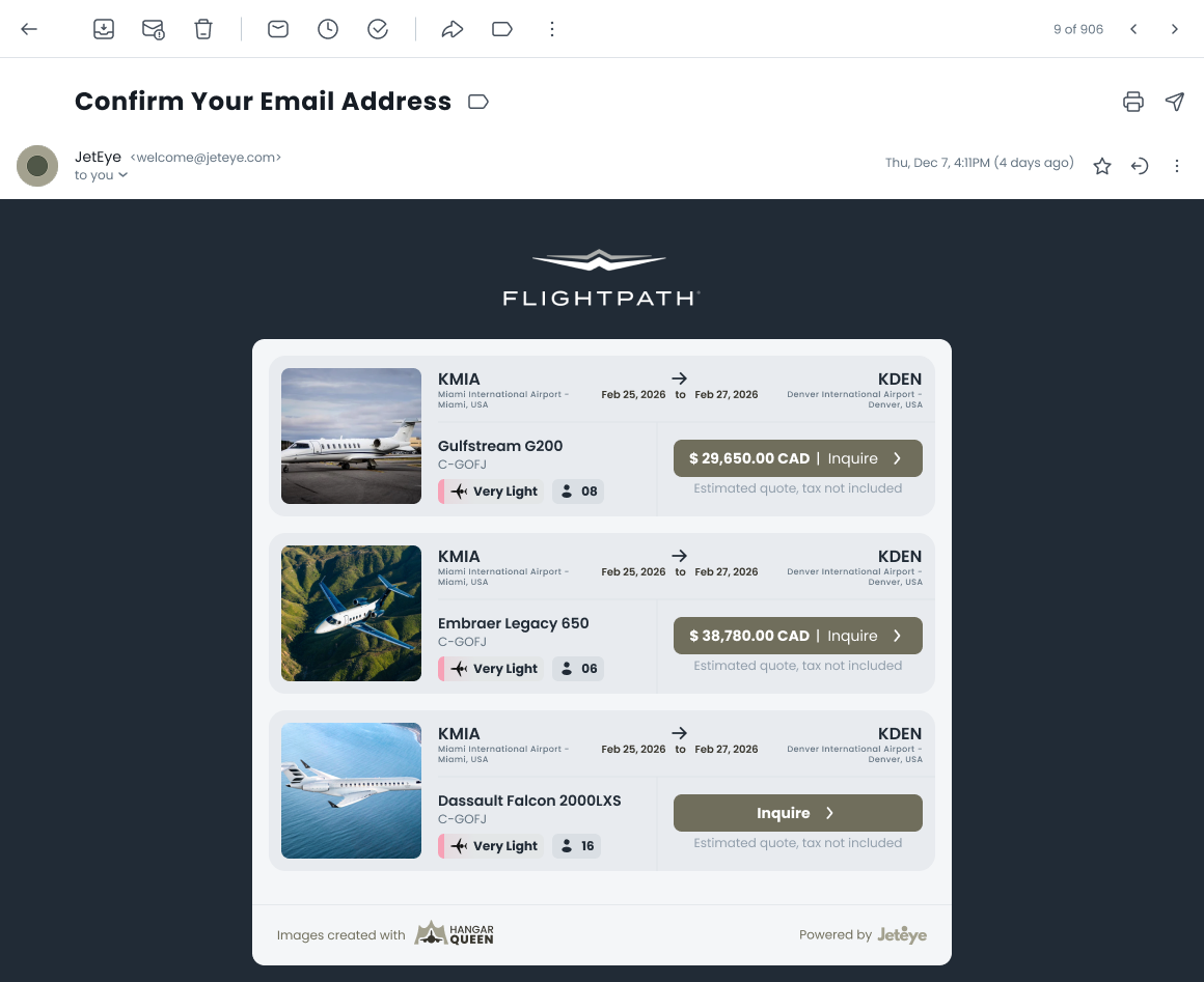
Transactional email design
The empty leg alert email: route header, aircraft details, operator attribution, availability window, a single primary CTA, consistent with JetEye's transactional email system, with a legally-clear unsubscribe path.
Empty leg alert email: one route, all operators, one CTA
Product marketing surface
Each product got its own landing page (TripScope, WebFleet, the Screener, BudgetBuilder, and HangarQueen) with a distinct identity, a one-line value proposition, and a per-product CTA, all sharing one reusable, responsive page system. Toggle between desktop and mobile below, and scroll within any frame or click to open.
TripScope
WebFleet
Screener
BudgetBuilder
HangarQueen
1 / 5
TripScope
WebFleet
Screener
BudgetBuilder
HangarQueen
08Outcomes
What shipped
Screener launched covering 1,800+ US Part 135 operators with monthly-refreshed FAA data, concentrating registry data that is scattered across government sites today.
A route-specific subscription model designed to maximize alert relevance and minimize churn.
Operators gained self-serve control of their public fleet presence, with zero web development required.
A consistent design language now spans the map, admin portal, embeds, and transactional email.
09What I Learned
Takeaways
Regulation is UX. Cabotage rules and runway minimums aren't backend trivia. They explain "why can't I book this?" moments. Designing honest empty and error states around them builds trust.
Real data beats lorem ipsum. Auditing fill rates and outliers (that one operator with 46 DBAs!) before designing tables prevented an entire class of layout failures.
Borrowed mental models accelerate adoption. Framing registry data as a "stock screener" gave a niche audience an instantly familiar interaction grammar.
Designing for embeds means designing for humility. The product must perform inside someone else's brand, on someone else's page.
Get in touch
Curious how five products share one design system? I am happy to open the JetEye Figma files.