01
Overview
A practice in a box, run by automation
Longeviti digitizes a physician's expertise and turns them into a scalable, personalized-care practice in a couple of hours per service vertical. The platform automates patient outreach, enrollment, and billing, so the doctor can focus on care instead of marketing.
Built for
Client
Longeviti Health, built at TSL
Platform
Responsive web + app
Domain
Concierge / personalized medicine
Scope
Research · Flows · IA · Prototyping · Visual
What the platform does
Marketing site
Physician-facing sales and sign-up
Guided onboarding
Set up a practice in one flow
AI marketing
Auto-generated video, site, and cadence
Portals
Physician and patient experiences
CRM & admin
Internal acquisition and oversight
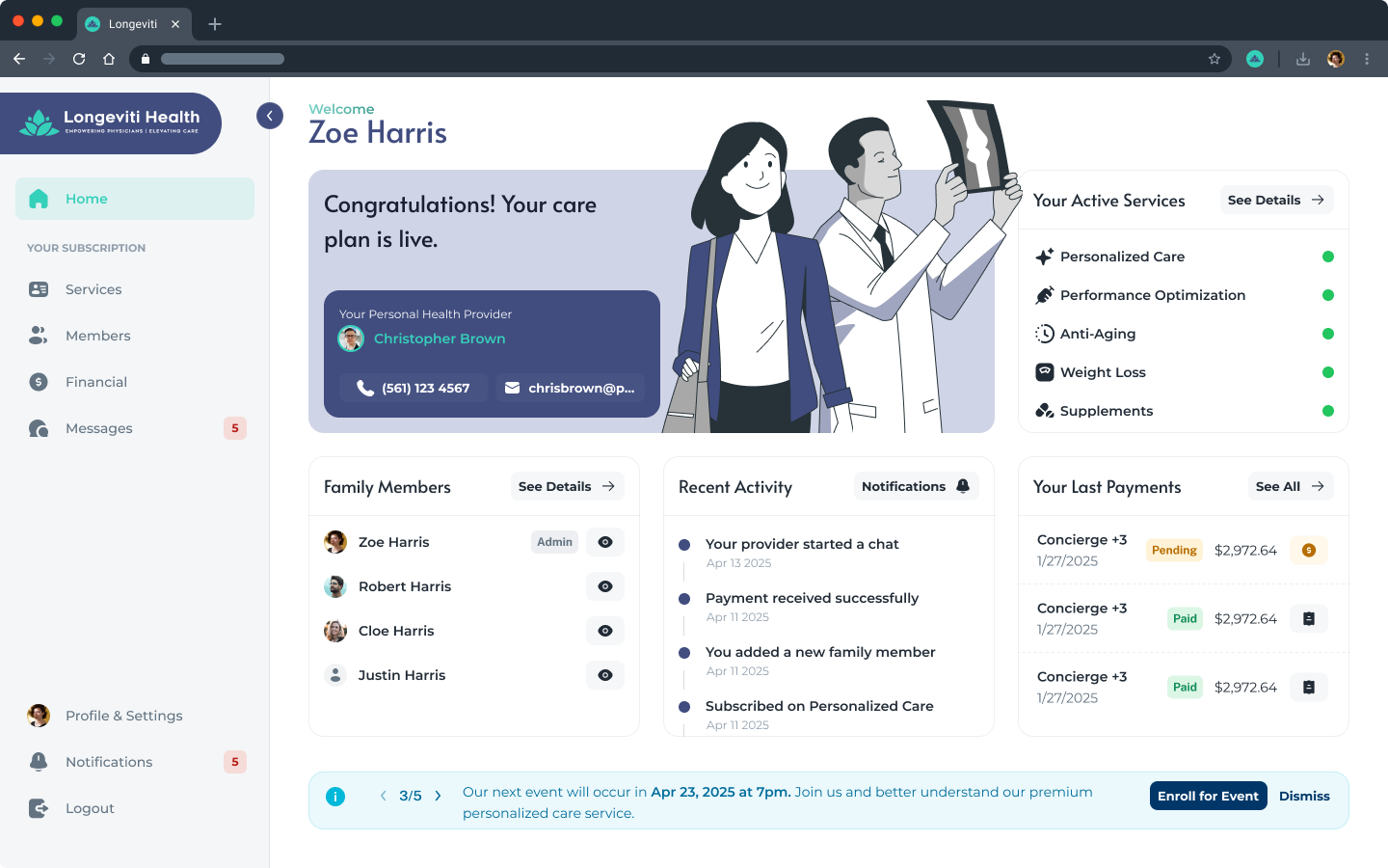
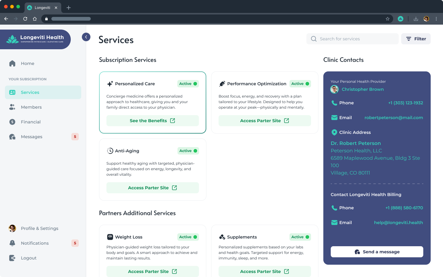
A cross-section of the platform, physician and patient sides
02
The Problem
Great doctors, stuck on a treadmill
The treadmill
Insurance rewards volume, not care
Physicians face financial instability and burnout under volume-driven insurance models, while carrying the clinical risk themselves.
The skill gap
Doctors are not marketers
Selling high-value services takes marketing, outreach, and follow-up, exactly the work physicians have no time or appetite for.
The cost of switching
Concierge is hard to start
Existing concierge solutions are labor-intensive and inefficient, which keeps most physicians from ever making the move.
Two skeptics
Trust has to be built twice
Physicians are wary of new systems; patients often do not even understand the word "concierge." The product has to win both at once.
Two audiences had to say yes at once. The doctor is skeptical of new systems and has no time to run one; the patient has never heard the word "concierge" and is allergic to hidden fees. Every screen below answers to both.
03
Discovery & Research
Making a complex business legible
Longeviti was a new venture with a large, automation-heavy model, so discovery was about making that model legible before designing a single screen. I set a visual direction, then mapped the entire system as flowcharts so features, screens, and states were agreed before any UI. Personas and journeys (shown in the next two sections) kept both audiences in focus throughout.
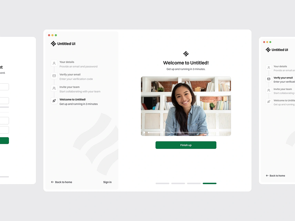
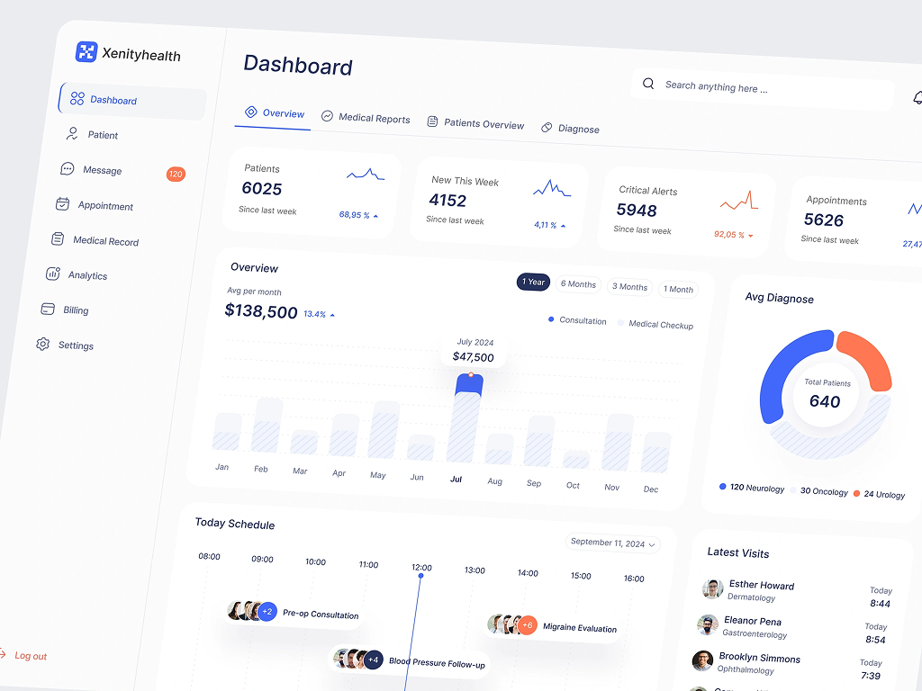
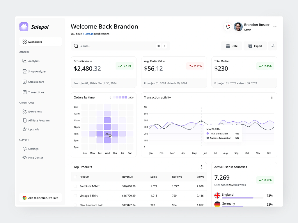
Visual research
I aligned the visual direction with what these users expect and with the product's need to earn trust. The result is a minimalistic, calm interface that guides people through dense, high-stakes steps (contracts, payments, medical setup) with low cognitive load.
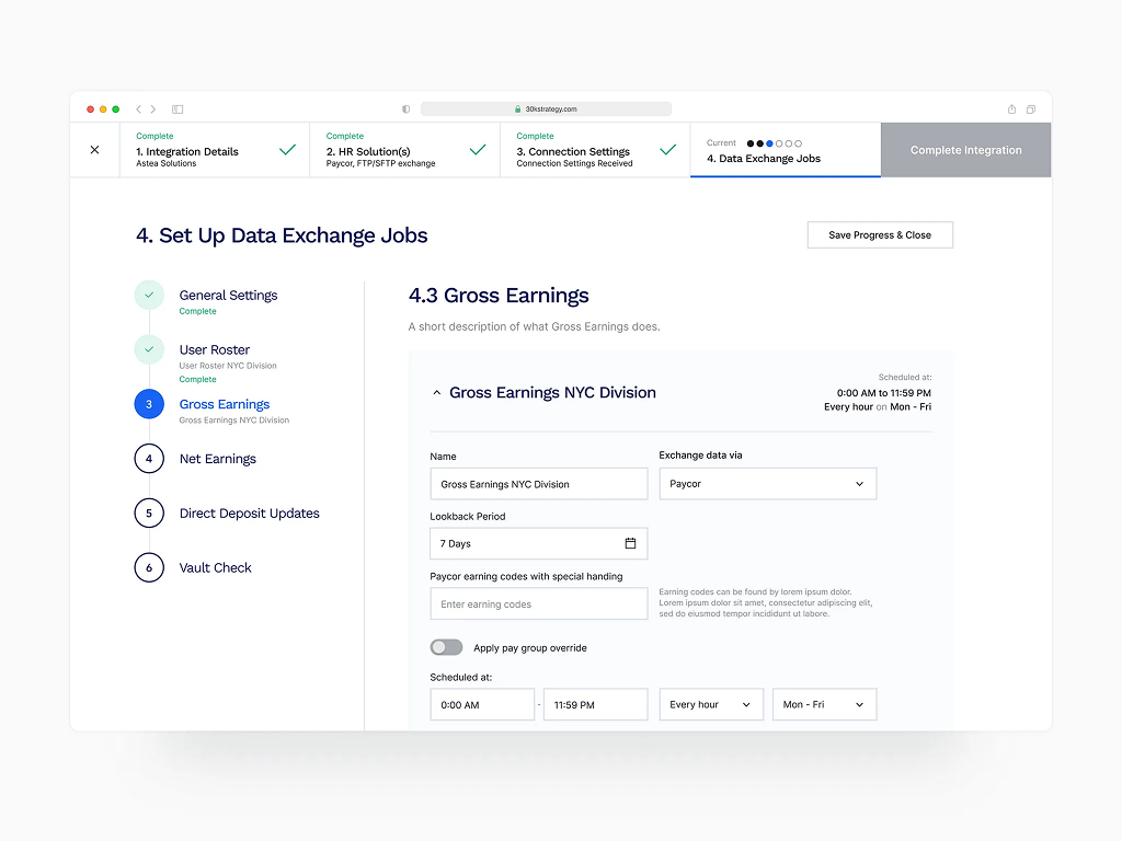
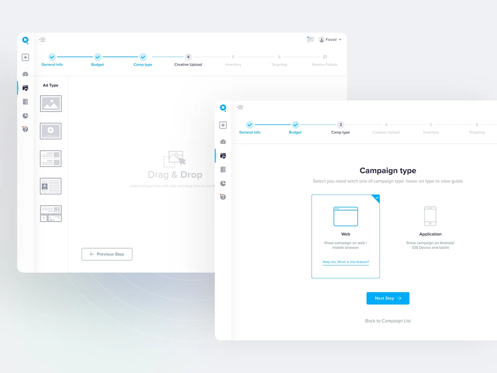
System flowcharts · the heart of discovery
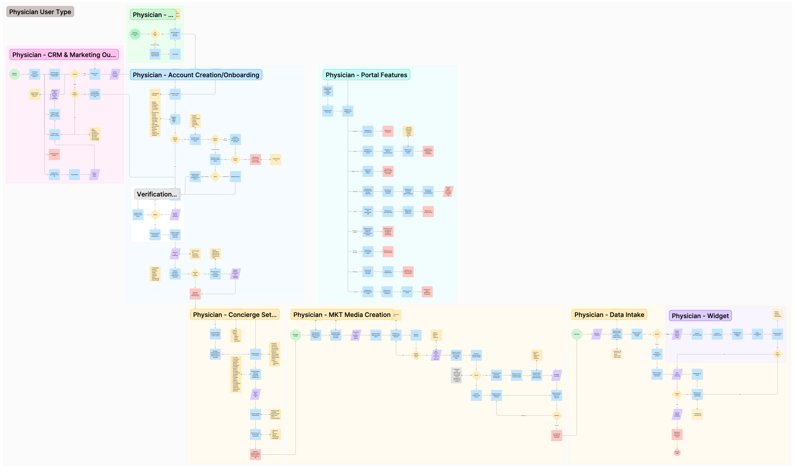
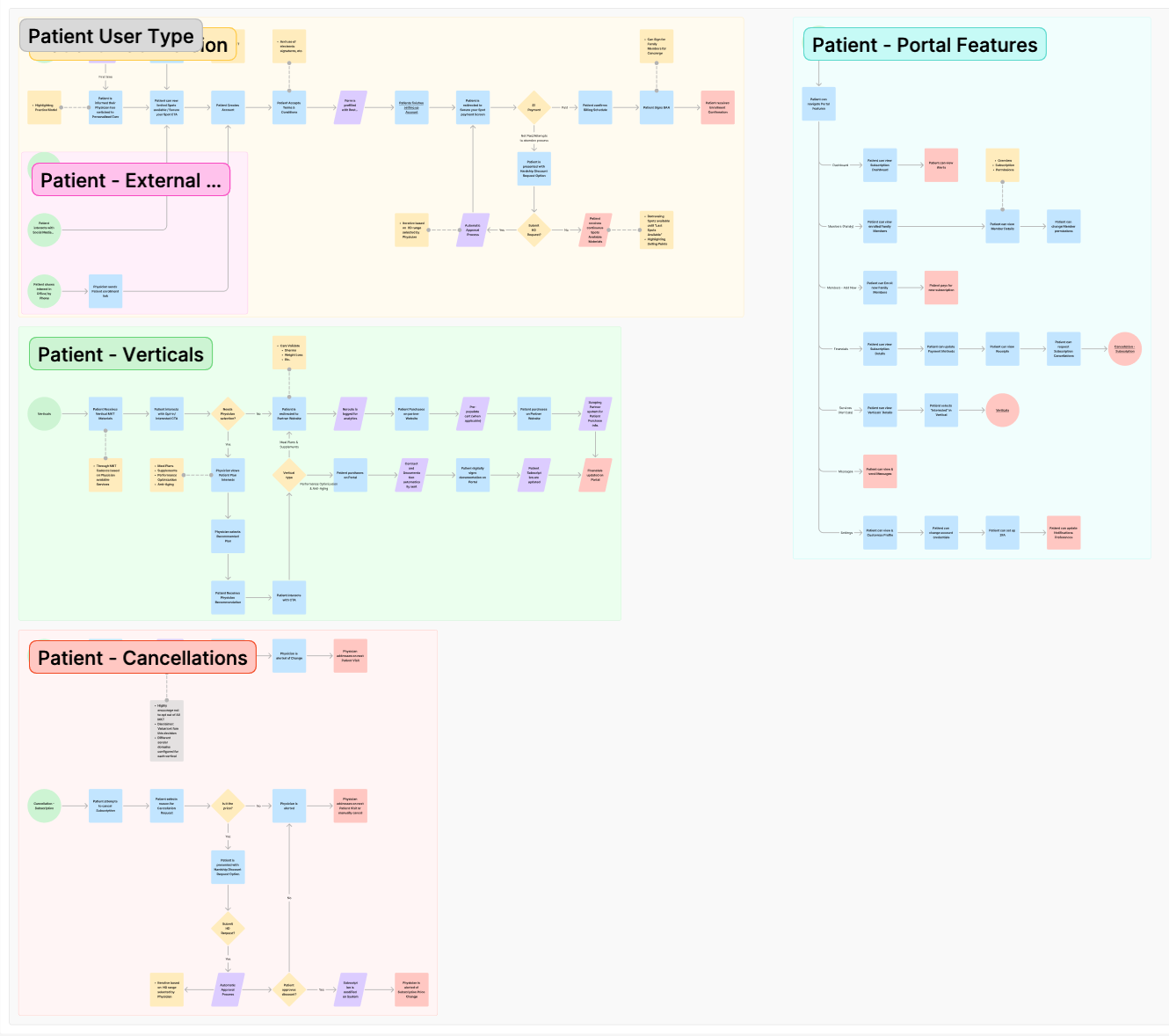
Before UI, I mapped the whole application as flowcharts: eleven flows in total, seven for physicians and four for patients. The physician flows chain into one continuous journey, from the marketing site through account creation, concierge setup, marketing-media creation, and data intake, into the portal. Designing them as one path, rather than isolated screens, is what kept a long setup from feeling like a maze.
CRM & outreach
Marketing site
Account creation
Concierge setup
Marketing media
Data intake
Patient conversion
Upsell & cancellation
The core insight: automation-first
The system does the work. AI-generated video and marketing assets, auto-generated domains, automated marketing cadences, and automated financial analysis mean the physician mostly reviews and approves rather than builds.
Humans at the gates only. Longeviti staff step in at the few high-stakes moments (identity-verification fallback, recording approval, lead pipeline), not in between.
Retention is designed in. The cancellation paths carry a hardship-discount negotiation and opt-out friction, so keeping a patient is part of the interaction, not an afterthought.
04
Personas
Two sides of one marketplace
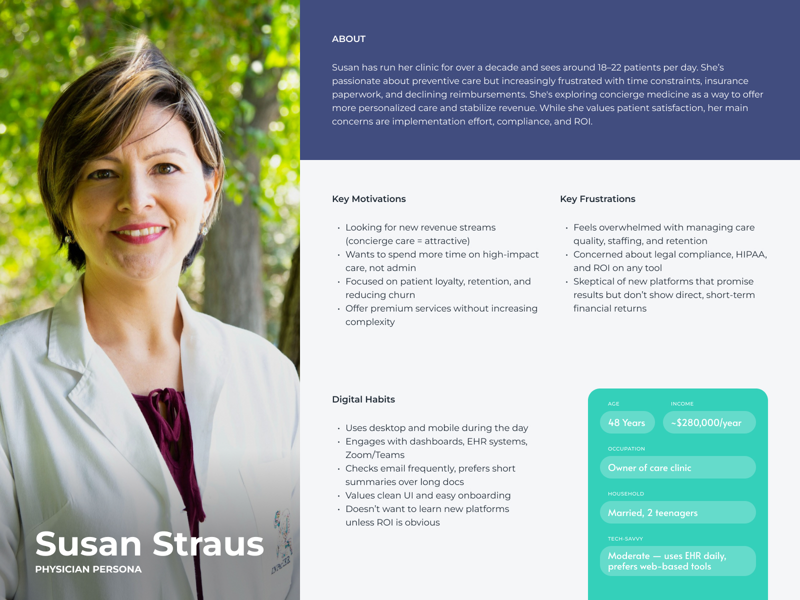
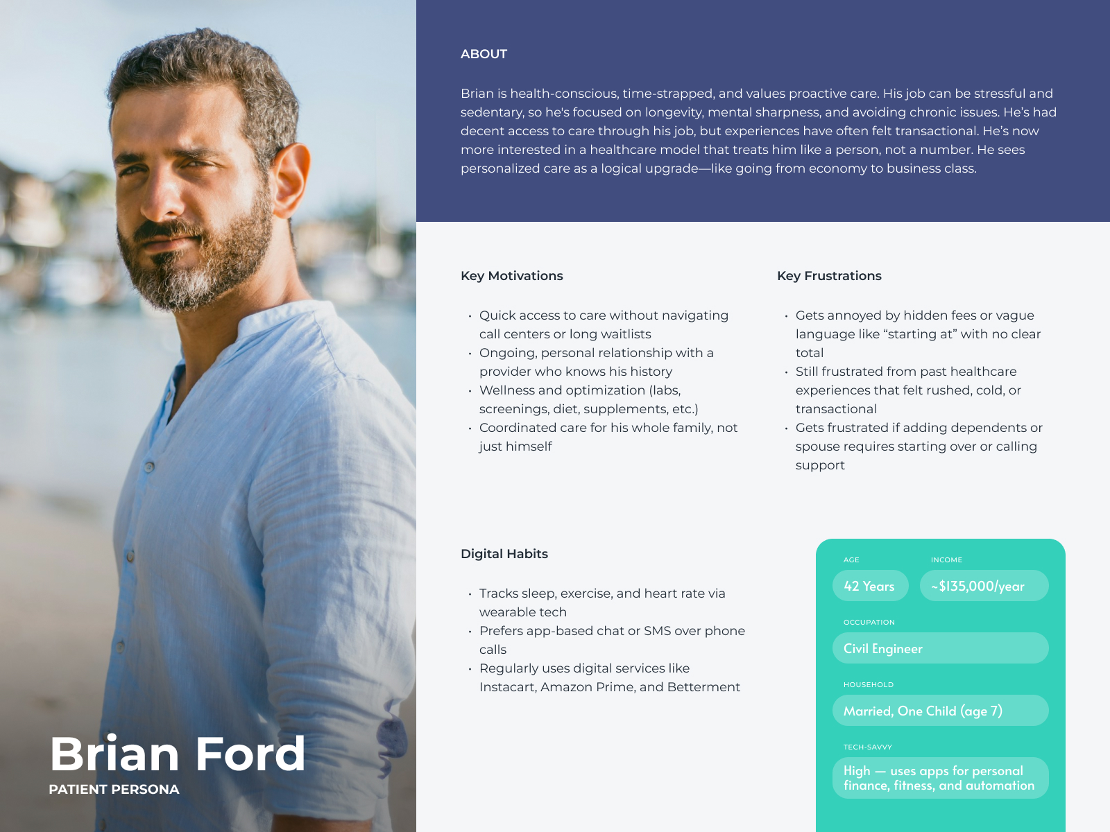
With no existing user base, I built proto-personas to keep the two audiences honest: the physician is the primary user and the hardest to win, the patient is the volume user who has to trust a new model fast.
1 / 2
05
Journeys & Flows
Two long journeys, made to feel short
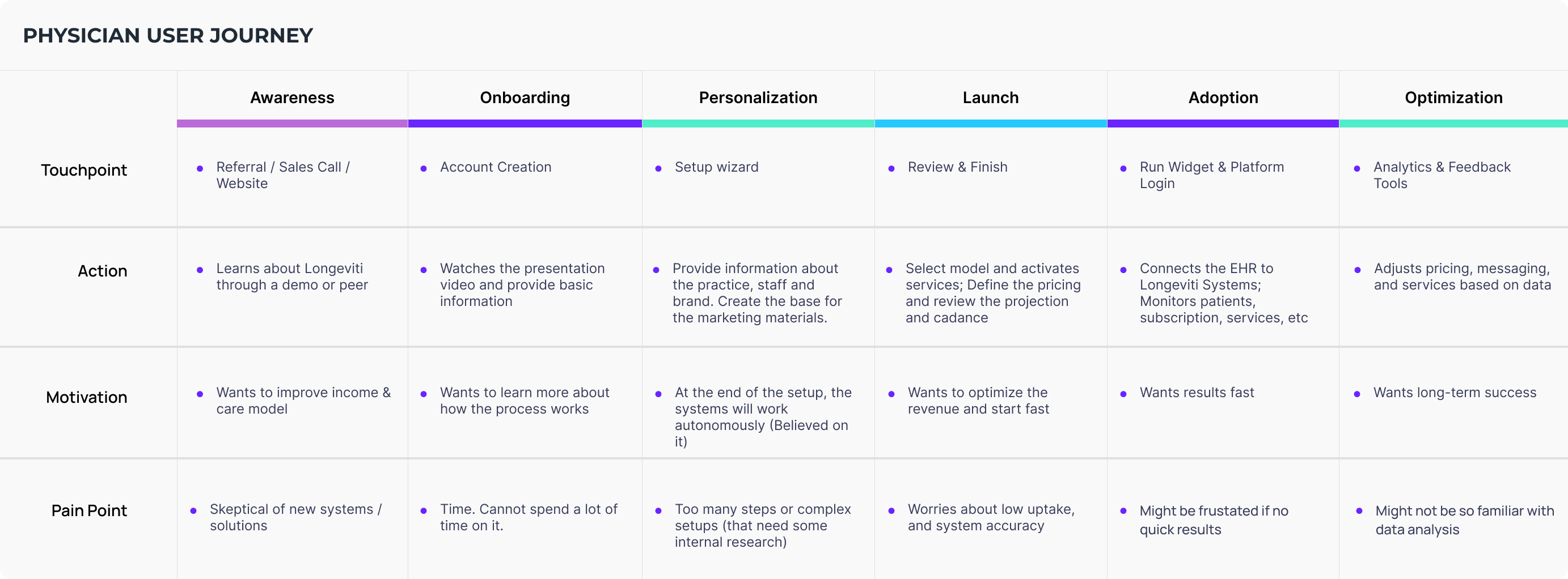
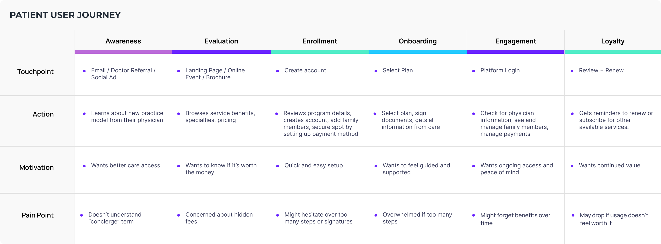
Each persona turned into a headline journey. Both are long and high-stakes, so I mapped every phase with its touchpoint, action, motivation, and pain point, then designed them as continuous, guided paths. The physician goes from a skeptical lead to a running practice; the patient goes from a roster name to an enrolled member.
1 / 2
06
Wireframes
Structure before visuals
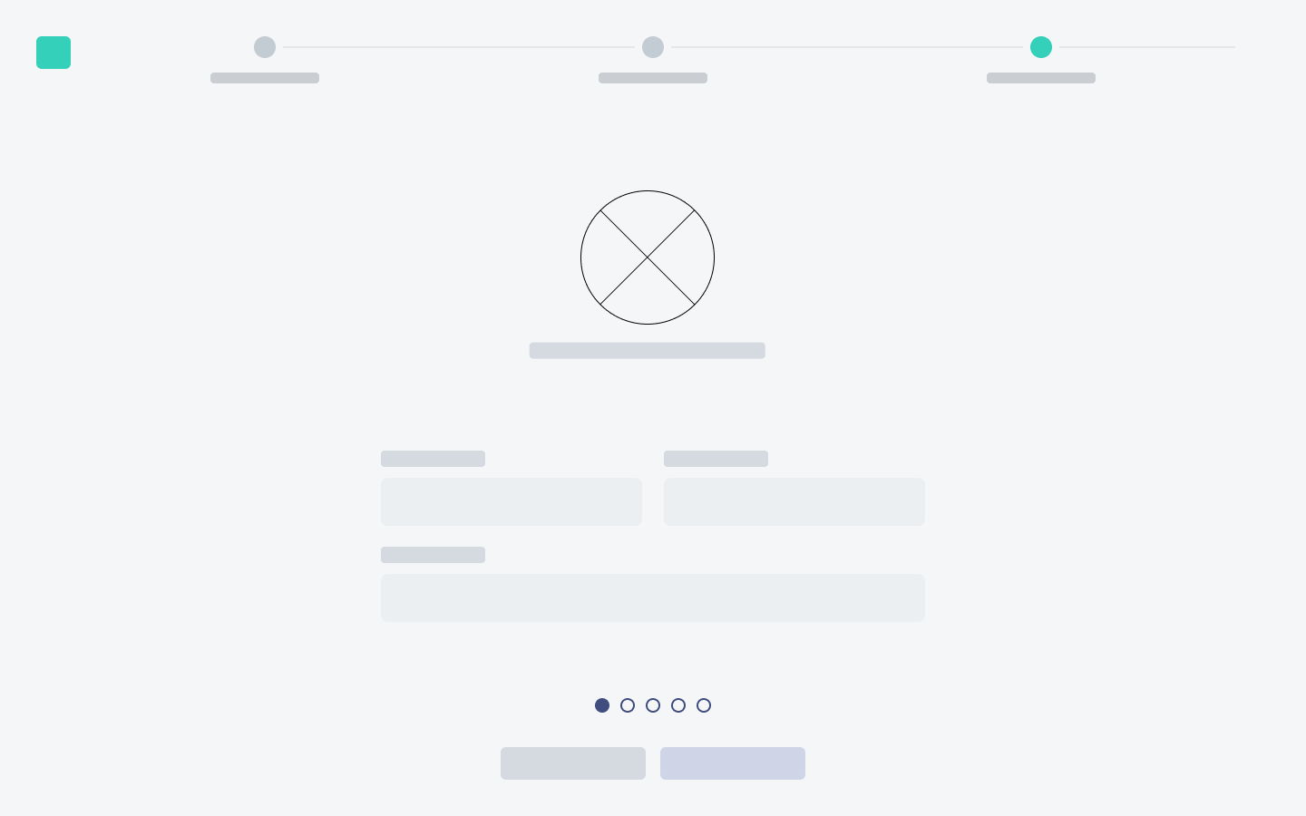
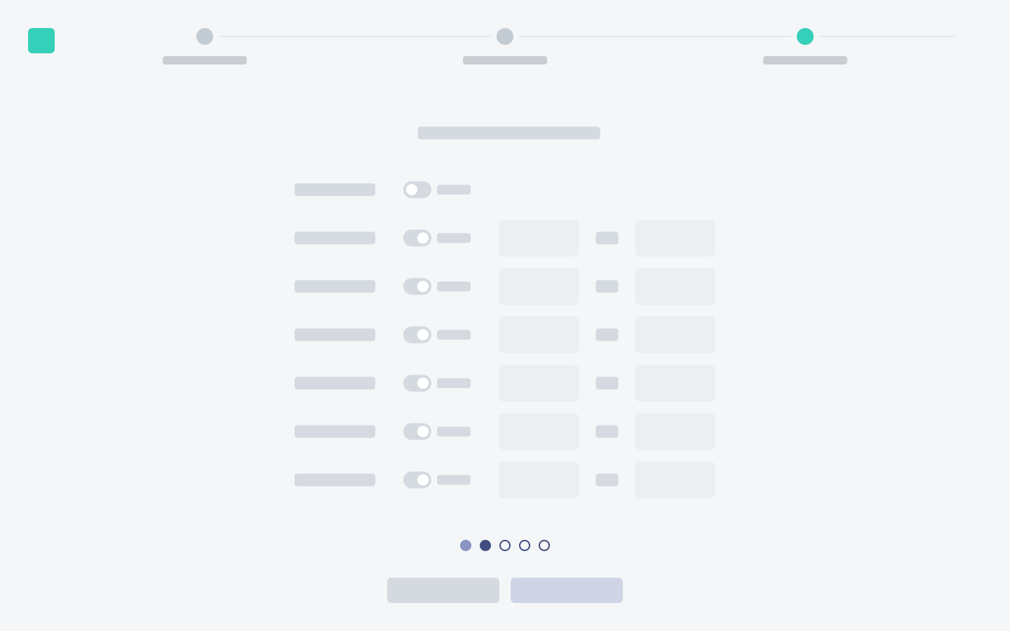
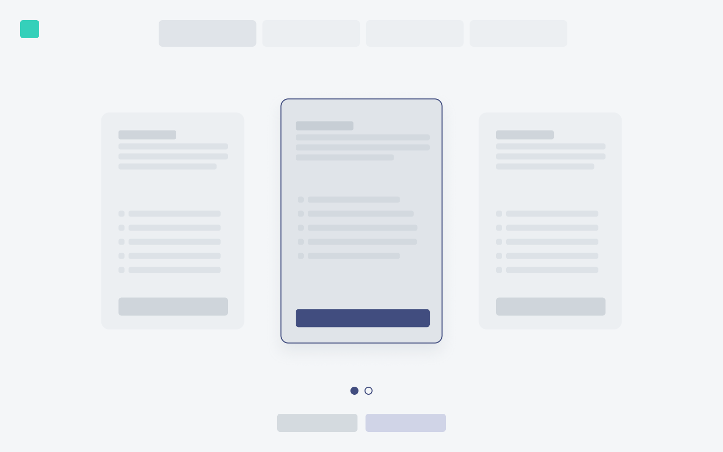
With the flows agreed, I wireframed the core surfaces in low fidelity to test the information architecture and the content hierarchy before committing to visual design. Wireframes let me align the team quickly and make sure every element earned its place, especially on the dense onboarding and portal screens.

1 / 4
07
High-Fidelity Design
A calm interface over a complex machine
With the structure settled, I built the high-fidelity system: a minimalistic, trustworthy interface that carries contracts, e-signatures, payments, and medical data without overwhelming anyone. Interaction is intentional, with progressive disclosure and whitespace to reduce cognitive load, and every branch, empty state, and per-vertical variant was designed, not just the happy path.
Design system
Built on a shared component foundation and extended with Longeviti's own style guide, components, and layouts, so the marketing site, both portals, and the internal views all feel like one product.
Marketing site · physician-facing
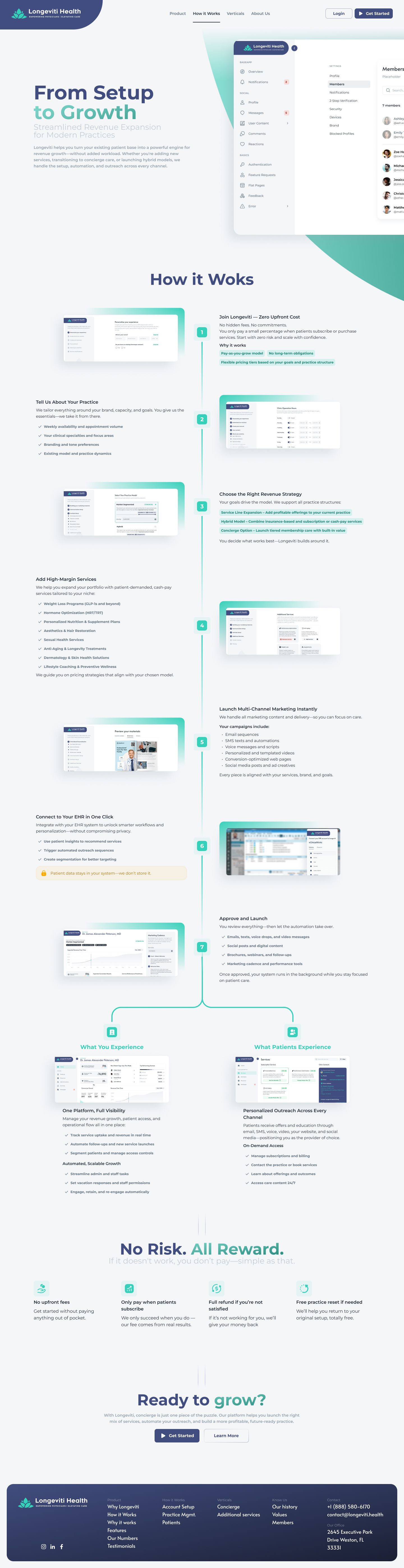
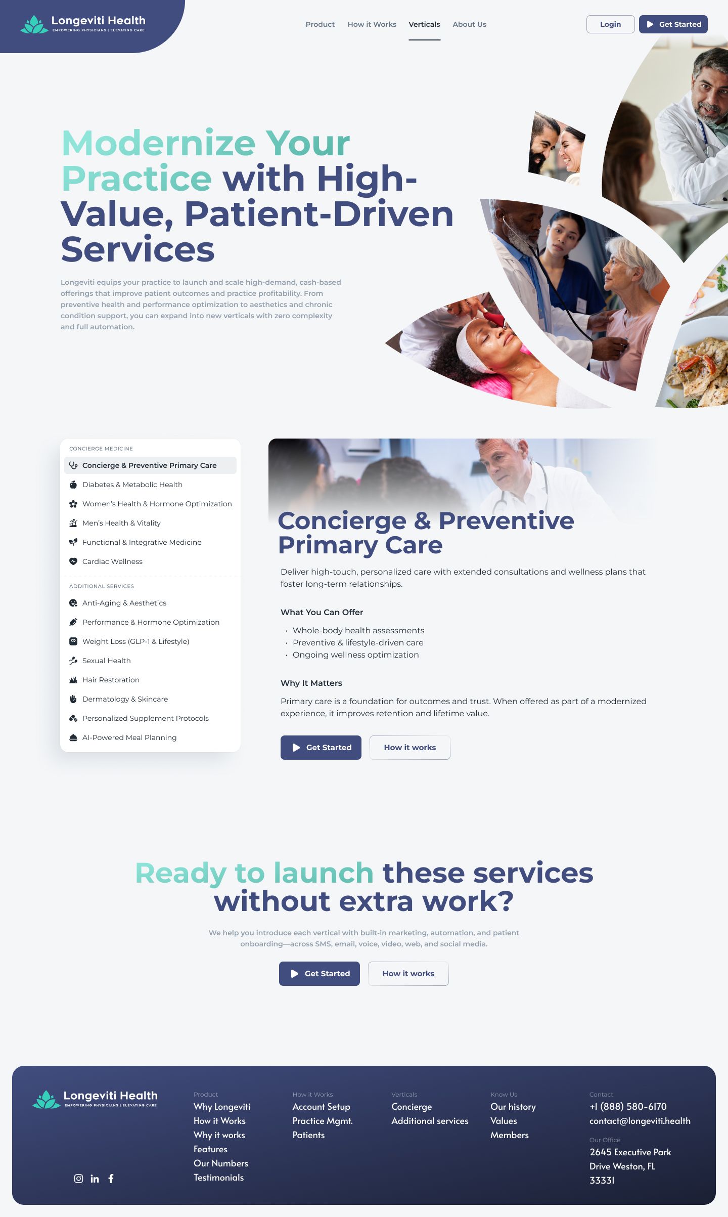
The sales site positions the physician as a strategic expert. Clear information architecture, a sales carousel of selling points, and honest, transparent framing lead to a short contact form that starts onboarding. It was designed responsively: toggle between desktop and mobile below, and scroll within any frame or click to open.

1 / 3



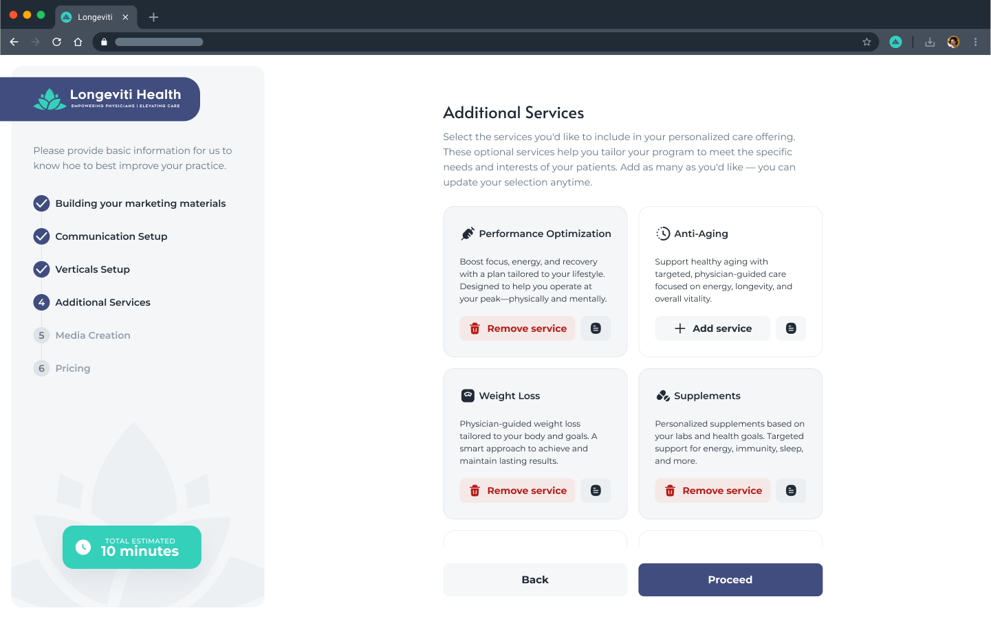
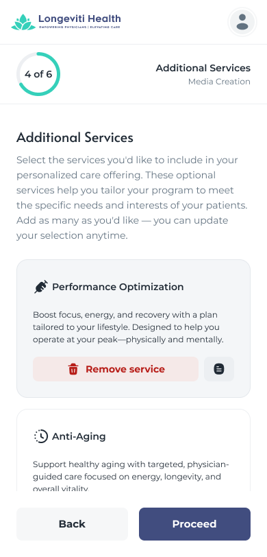
Physician onboarding · the guided setup
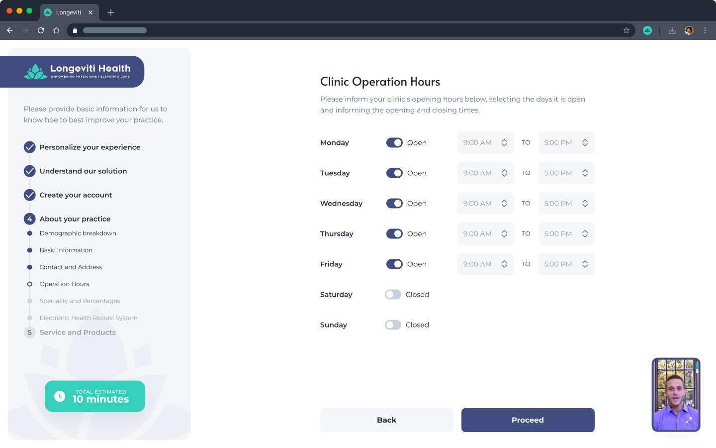
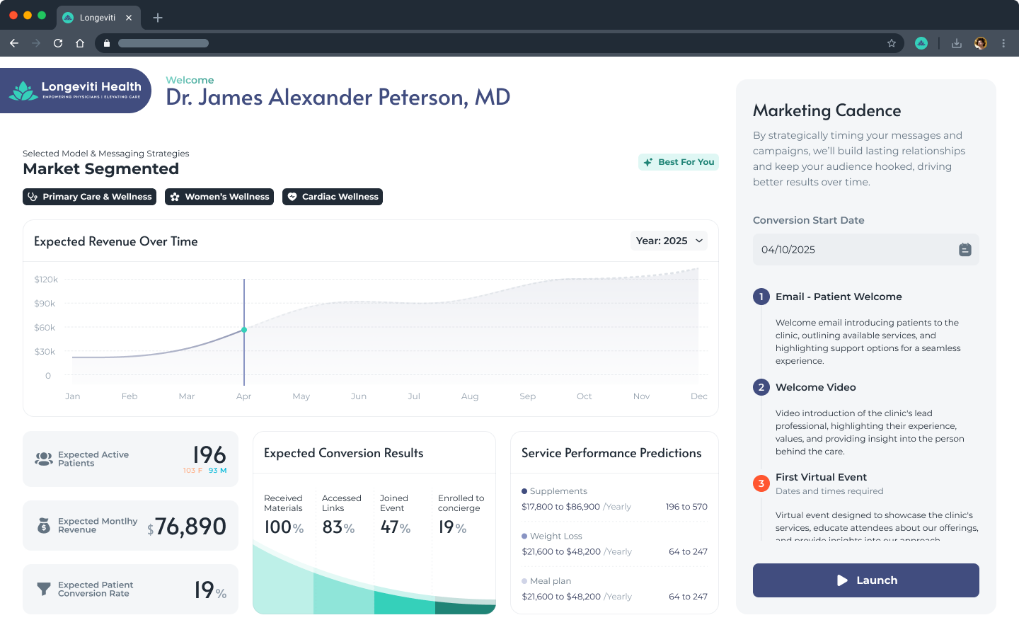
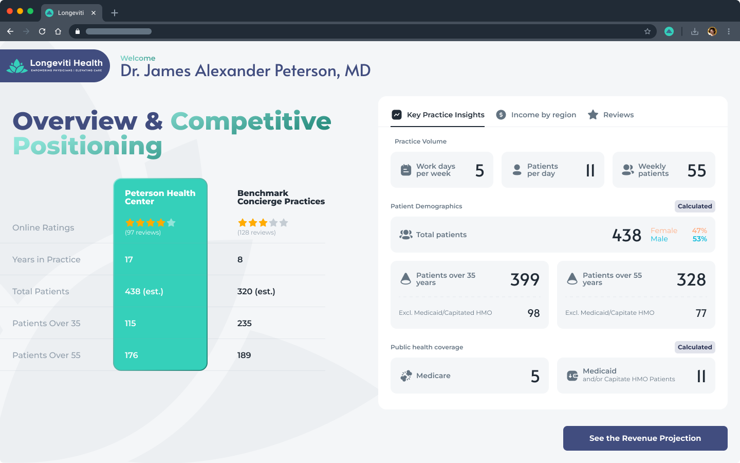
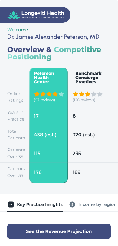
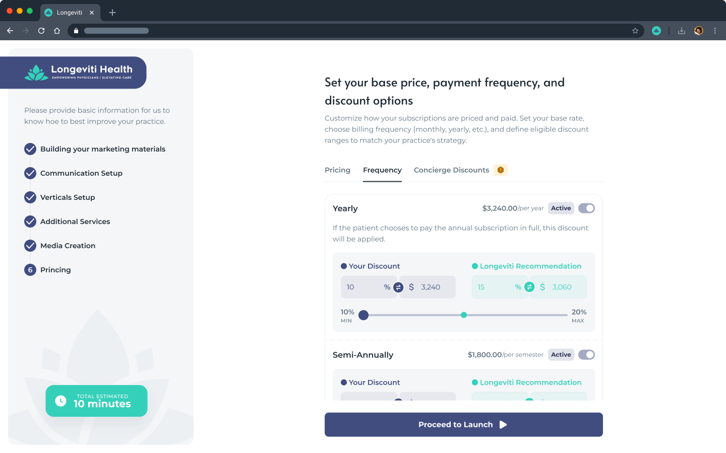
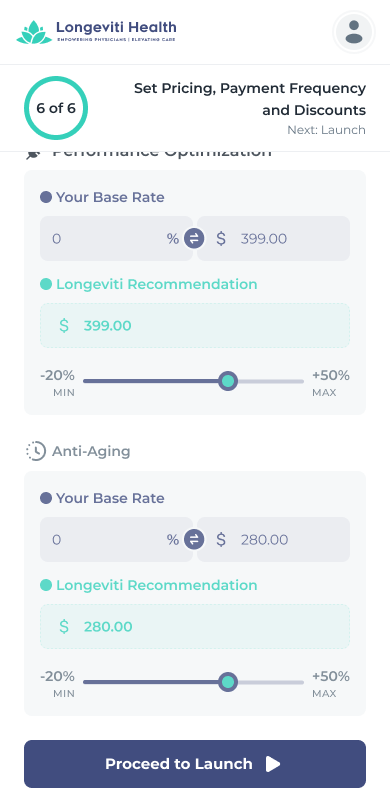
The longest, most branch-heavy surface, designed as one continuous flow: a short intro, practice details and demographics, contract-status and model branches, identity verification and consents, concierge setup with an automated financial comparison, brand personalization, pricing, and a final review. The opportunity dashboard shown in the overview is the moment that sells the switch.
1 / 3
Each step designed for desktop and mobile in parallel
AI & automation · the product's engine
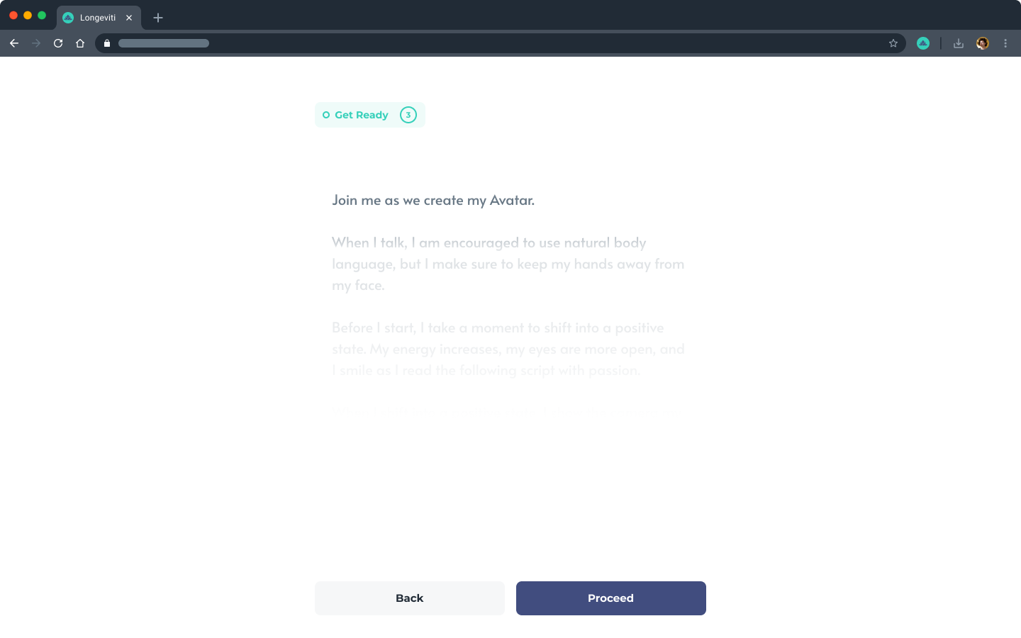
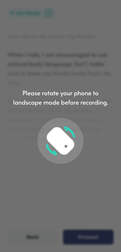
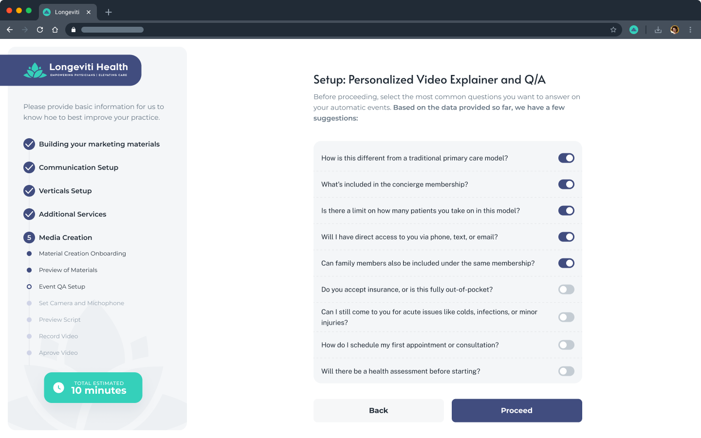
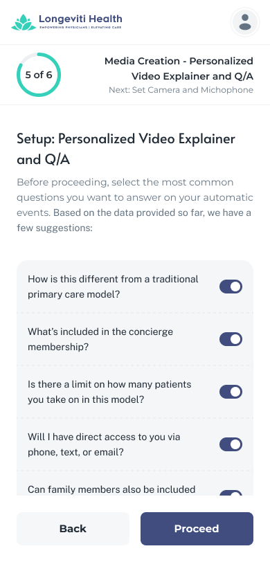
Automation is the whole thesis, so I designed the human-facing surface around it. The physician records a short script and the platform generates an AI marketing avatar, then auto-produces the domain, site, emails, and cadence. The doctor's job is simply to review and approve, with clear consent and privacy around the biometric capture.
AI marketing media. A guided recording flow (script, device checks, consent) produces a physician avatar and the marketing videos, with an AI or manual path per video.
Auto-generated assets and cadence. Domain options, brand, site, emails, and a timed marketing cadence are generated for the physician to review, not build.
Physician portal
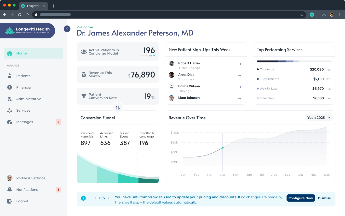
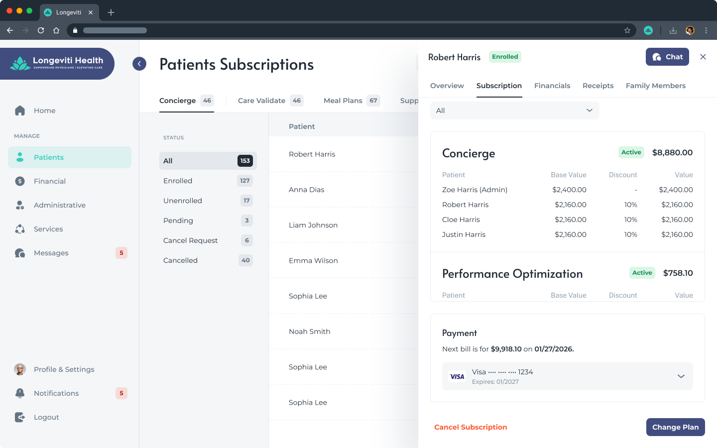
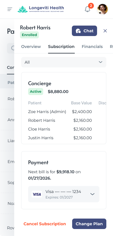
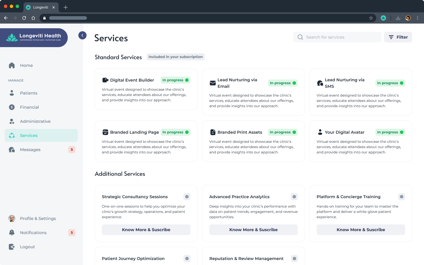
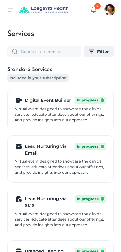
The running-practice cockpit. The strongest systems-thinking piece is the reusable Patient Drawer: one component with Overview, Subscription, Financials, Receipts, and Family Members tabs, designed across six vertical contexts (concierge, performance optimization, care validate, meal plans, supplements, and all). Alongside it, a services area brings together the automated marketing tools.
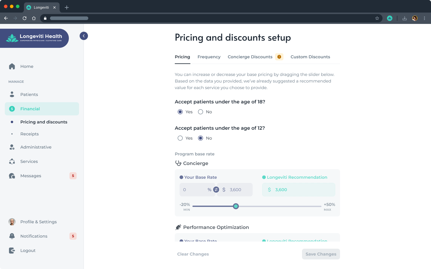
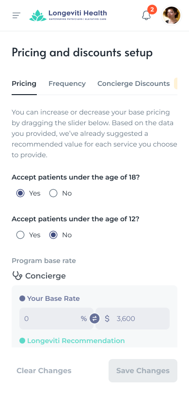
Pricing & the hardship-discount logic
A highlight worth its own note. Physicians set prices and discounts within recommended guardrails; going past a cap triggers an approval request. The hardship discount is a range the physician sets once, shown only when a new patient tries to leave without paying or an existing patient tries to cancel. The system then gradually raises the discount within that range to find the highest price the patient will still accept, never below the physician's floor. It is retention, designed as an interaction.
Guardrails, not free rein. Recommended ranges keep pricing consistent across the platform, with a confirmation and approval step when a physician goes beyond a cap.
A negotiation, automated. The hardship discount appears exactly at the drop-off moments and settles on the highest acceptable price, protecting both conversion and the physician's revenue.
Patient enrollment
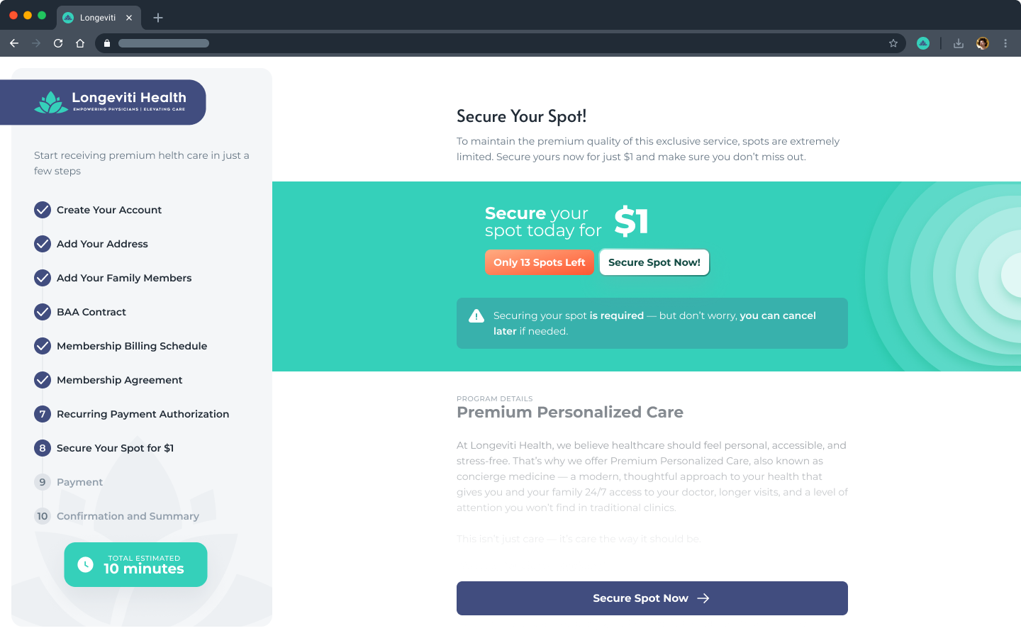
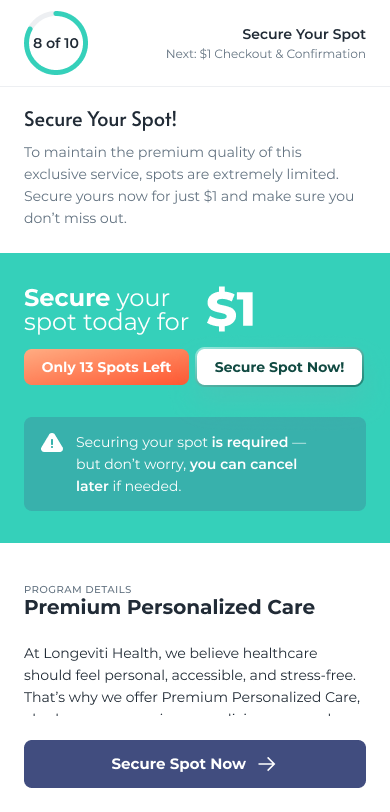
Designed to feel seamless and transparent: a personalized welcome, account creation from pre-filled information, terms and consent signing (including for family), a "secure your spot" step, a recurring-payment setup, and a clear confirmation. The full sequence was designed end to end, including the dialogs and the sidebar stepper.
Patient portal
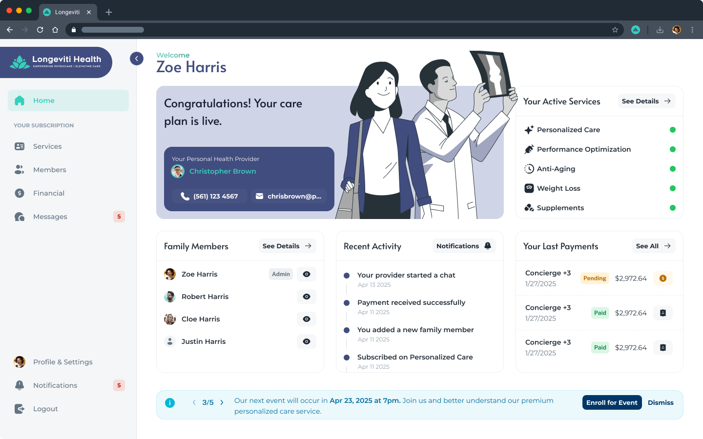
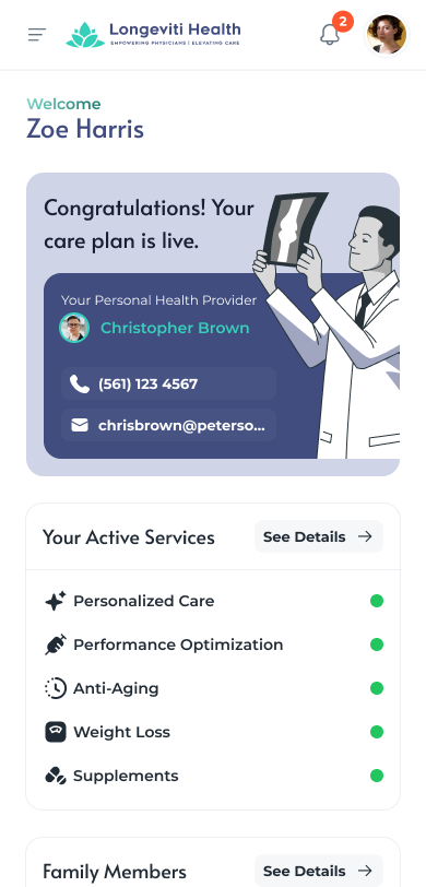
Where enrolled patients live: their care plan and provider, active services, family group (with a per-member drawer that keeps each person's details private), payments, and messaging. The dashboard and services views appear in the overview above; the patient area also gives clear control over the family group and subscriptions.
CRM & internal admin
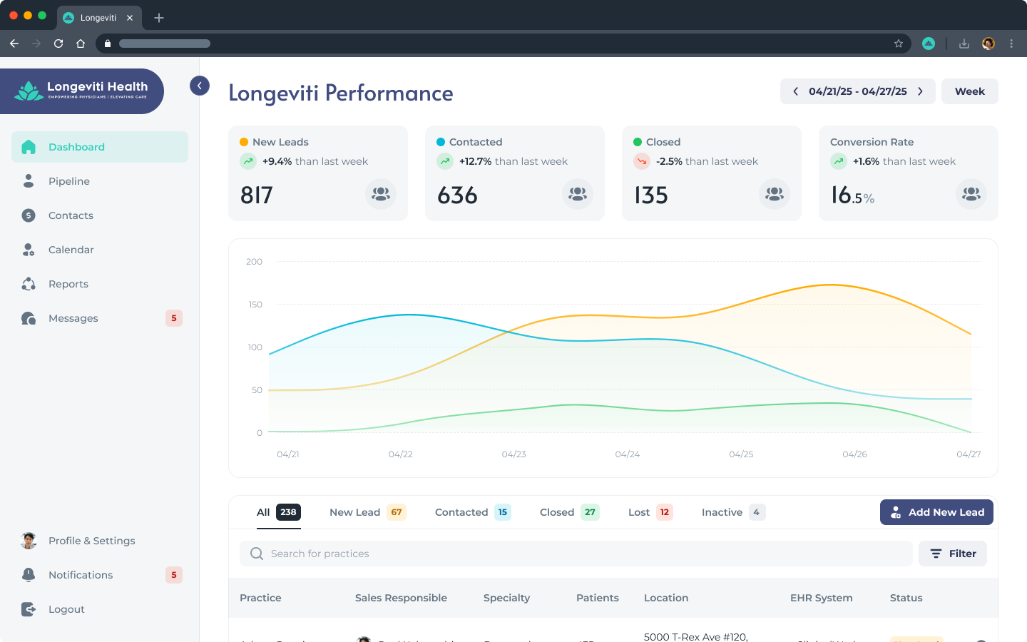
Behind both portals, Longeviti staff run acquisition and oversight. The CRM tracks the physician pipeline (new leads, contacted, closed, conversion rate), ranks communication channels, and manages mass outreach, while an admin view mirrors the physician portal so support staff work in a familiar system.
08
Outcomes & Recommendations
What the work delivered
Because this was a discovery and planning phase, the outcomes are the decisions and the plan the work produced, and the design coverage delivered, not live production metrics. The delivery separated finished surfaces from open questions, so the team knew exactly what still needed a decision.
A complete, flow-validated design system. Both portals, onboarding, enrollment, the marketing site, and internal admin, with every branch, empty state, and per-vertical variant designed.
One continuous physician journey. Chaining six setup flows into a single guided path was the decision that made a very long onboarding feel manageable.
A compliance-aware design. PHI and HIPAA touchpoints were tracked throughout (consent signing on both sides, biometric capture for AI video, health-record import, partner-purchase tracking) and flagged as risks with mitigations.
Decisions the discovery drove
Automation-first, human at the gates: a review-and-approve interface, not a do-it-yourself one.
Retention designed into cancellation, through the hardship-discount negotiation and opt-out friction.
Trust for two skeptics, through progressive disclosure, transparent pricing, and clear consent.
Honest about the gaps
The internal CRM is the least-developed surface, called out as such rather than overstated.
Data intake was scoped desktop-first, a responsive decision flagged for confirmation.
A prioritized, phased product roadmap the team could build against straight away.
09
What I Learned
Takeaways
Map the business before the buttons. For a model this complex, the flowcharts were the real design work. Getting the eleven flows and their chaining right is what made the screens obvious.
Design the whole state machine, not the demo. The edge cases, the branches, and the less-glamorous states are where a healthcare product actually lives, so I designed for them from the start rather than bolting them on later.
Automation changes the UI's job. When the system does the work, the interface is mostly about trust, review, and approval. That reframed almost every screen.
Compliance is a design constraint, early. Consent, biometric capture, and health-data handling are steps in the flow, and they had to be designed to feel safe.
Get in touch
Eleven flows, two portals, one automation-first design. Want the walkthrough?